
A student living brand for the now.
_Now isn't just a brand name; it's a mindset. It captures that sweet spot where spontaneity meets intention. This is not just a place to live, but a place to thrive. This project was not about adding to the pile of cookie-cutter student brands, we had to cut through the cluttered tired cliches.

Naming
Brand messaging
Visual identity
Logomark
Art direction
Motion
Wayfinding
Brand rollout
Brand messaging
Visual identity
Logomark
Art direction
Motion
Wayfinding
Brand rollout


Project overview
Client
Generation Estates
Project undertaken
2023
Region
UK
Related
Sector
Property
Disciplines
Naming
Brand messaging
Visual identity
Logomark
Art direction
Motion
Wayfinding
Brand rollout
Brand messaging
Visual identity
Logomark
Art direction
Motion
Wayfinding
Brand rollout
Team
_Creative Direction
Paul Irwin
_Design
Ellen Teale
Luke Farquharson
_Client team
Millie Jones
_Writing
Paul Irwin
Millie Jones
Paul Irwin
_Design
Ellen Teale
Luke Farquharson
_Client team
Millie Jones
_Writing
Paul Irwin
Millie Jones
The context
After collaborating with Generation Estates on their success Here!, they looked to us again for their next project. This time for a UK-only venture that needed its own distinct name and identity within their growing portfolio.
The craft
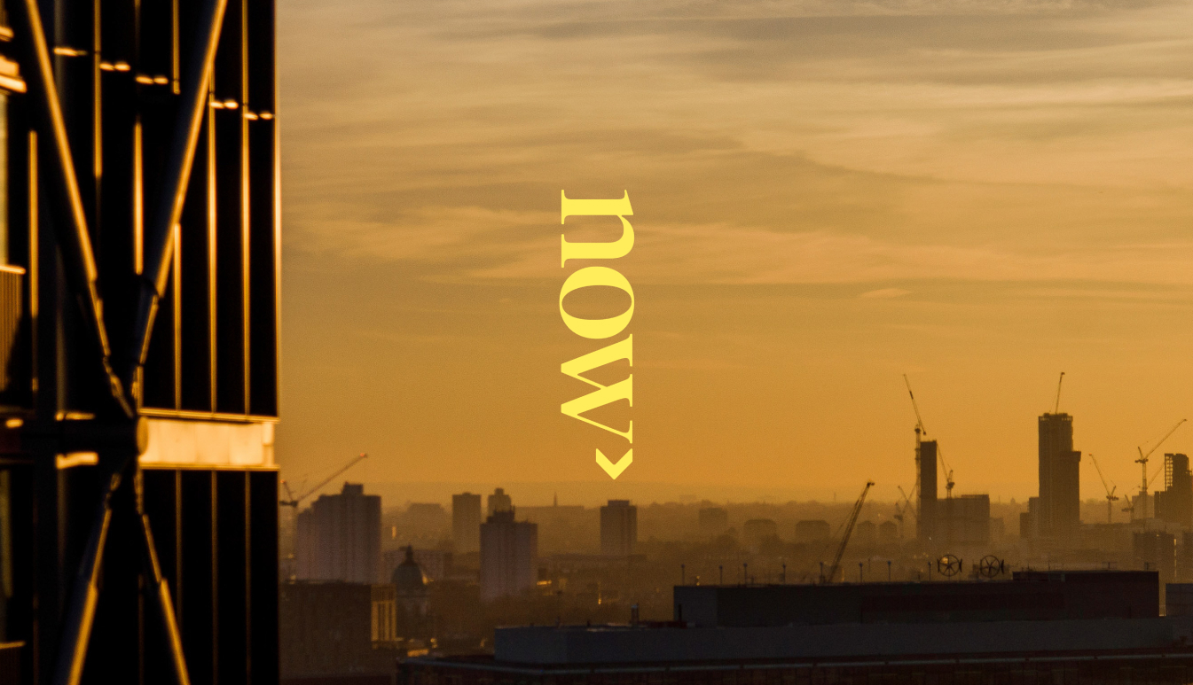
When it came to the name, there was only one place to go from Here. It had to be Now. From there, we began building a brand identity around the moniker and the mindset and tackling the broader identity challenge of how to be playful without being childish, and sophisticated without being stuffy.
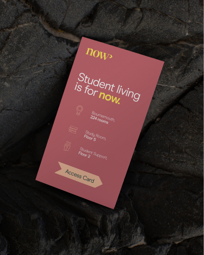
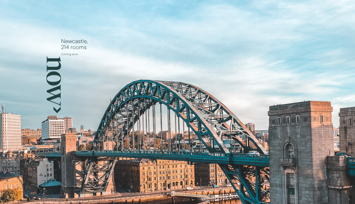
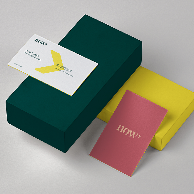
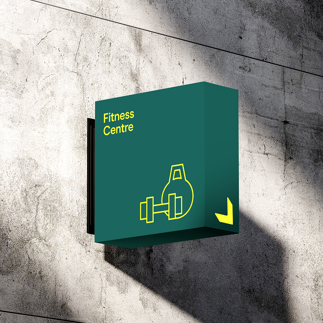
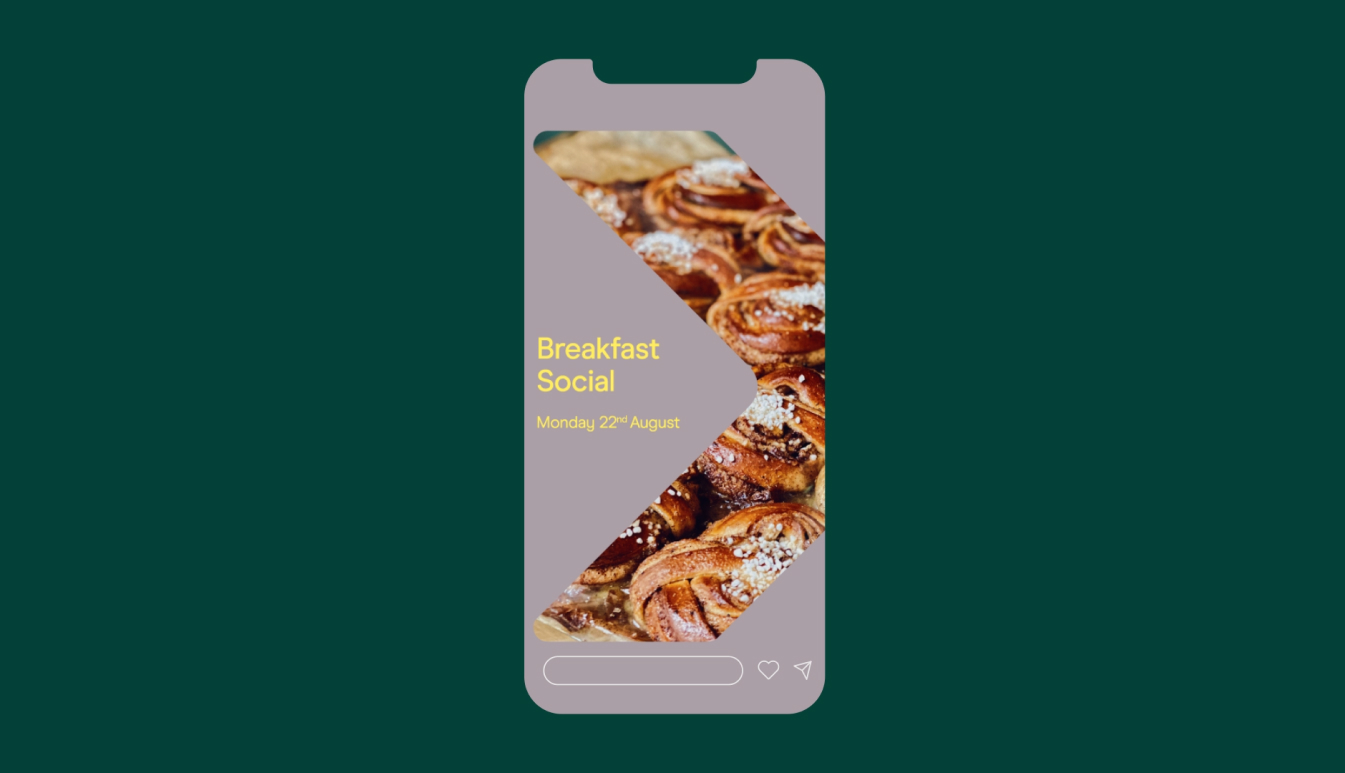
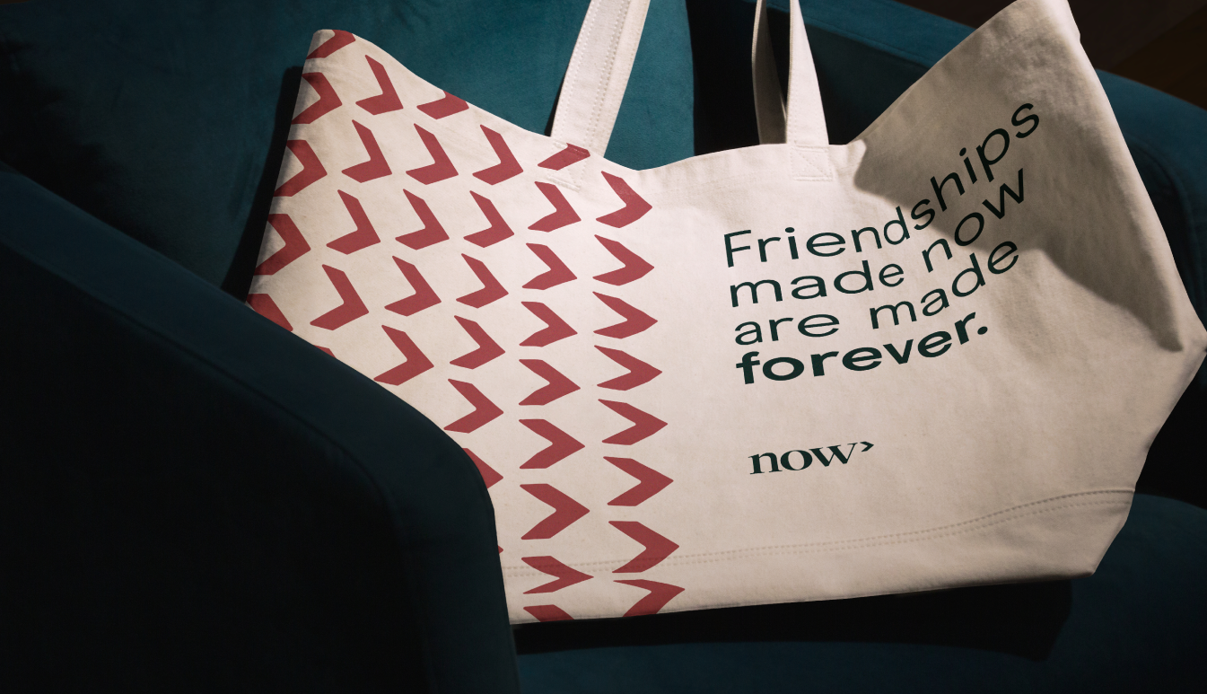
The logomark captures the brand's forward momentum and became the foundation for our entire visual system. In motion, it translates seamlessly into a defining principle for all movement when bringing the brand to life across digital touchpoints. Elsewhere, it is able to transform into whatever the moment demands: a stage for typography, a housing for imagery, pattern creation, location markers and even wayfinding.
Pairing all this with a considered colour palette, we brought the brand’s personality to life. A yellow floods the brand with optimism and approachability. Blue grounds everything with reliability and calmness, while purple injects a certain creative energy that keeps things from feeling too staid or pedestrian.
Finally, we anchored everything with a typeface that walks the line between functional and characterful. It's got enough personality to command attention in headlines yet remains readable when our audience are down in the detail.
The end result
The brand rollout flexed across every touchpoint, from that first digital encounter to move-in day and beyond. Whether students were scrolling through social media, navigating the website, receiving welcome packs, or walking through common areas, consistency was key. So, we created brand guidelines that empowered Generation’s teams and the teams on the ground to maintain consistency while allowing flexibility for local market needs or trends.
After collaborating with Generation Estates on their success Here!, they looked to us again for their next project. This time for a UK-only venture that needed its own distinct name and identity within their growing portfolio.
The craft
When it came to the name, there was only one place to go from Here. It had to be Now. From there, we began building a brand identity around the moniker and the mindset and tackling the broader identity challenge of how to be playful without being childish, and sophisticated without being stuffy.
The logomark captures the brand's forward momentum and became the foundation for our entire visual system. In motion, it translates seamlessly into a defining principle for all movement when bringing the brand to life across digital touchpoints. Elsewhere, it is able to transform into whatever the moment demands: a stage for typography, a housing for imagery, pattern creation, location markers and even wayfinding.
Pairing all this with a considered colour palette, we brought the brand’s personality to life. A yellow floods the brand with optimism and approachability. Blue grounds everything with reliability and calmness, while purple injects a certain creative energy that keeps things from feeling too staid or pedestrian.
Finally, we anchored everything with a typeface that walks the line between functional and characterful. It's got enough personality to command attention in headlines yet remains readable when our audience are down in the detail.
The end result
The brand rollout flexed across every touchpoint, from that first digital encounter to move-in day and beyond. Whether students were scrolling through social media, navigating the website, receiving welcome packs, or walking through common areas, consistency was key. So, we created brand guidelines that empowered Generation’s teams and the teams on the ground to maintain consistency while allowing flexibility for local market needs or trends.
Typefaces
Modern Era
Acumin Pro
Acumin Pro
20 years ago, our business created two of the most iconic and enduring brands in the Purpose Built Student Accommodation sector. In creating our new platform we knew we wanted our visual identity to be equally memorable but also reflective of how the sector and our customer base had evolved during that time.The team at Studio Certain understood that and gave us the platform to share our knowledge and vision. They harnessed that passion, created a forum where we could collaborate and achieve some epic outcomes. Key to us as a business is that any project we engage with is fun - we framed every session with Studio Certain in that way and they totally delivered.
Paul Watson
Co-Founder and Managing Director - Now Student Living
Co-Founder and Managing Director - Now Student Living
More projects