Fresh fit for one of the UK's most trusted finance providers.
_Millions of customers, five business units, one unified brand positioning…A new name and a new look, but built on the same commitment. Helping millions of people achieve their ambitions, every day.

Brand messaging
Visual identity
Art direction
Campaign
Motion
Brand rollout
Visual identity
Art direction
Campaign
Motion
Brand rollout

Project overview
Client
Novuna
Project undertaken
2021
Region
UK
Related
Sector
Financial Services
Disciplines
Brand messaging
Visual identity
Art direction
Campaign
Motion
Brand rollout
Visual identity
Art direction
Campaign
Motion
Brand rollout
Team
_Creative Direction
Steve Johnston
_Design
Paul Irwin
Ellen Teale
Luke Farquharson
_Client team
Alice Lyons
_Writing
Paul Irwin
Steve Johnston
_Design
Paul Irwin
Ellen Teale
Luke Farquharson
_Client team
Alice Lyons
_Writing
Paul Irwin
The context
Markets shift fast. And after 40 years of being one of the UK's most trusted finance providers, Hitachi Capital (UK) found itself in a landscape more crowded and competitive than ever. And with finance offerings flexing across multiple audiences, they needed a new name and identity that could fluidly fit everything from the business, personal, and vehicle finance sectors.
The craft
The name is a combination of Latin phraseology - ‘Nov’ derives from the Latin word ‘Novo’ which means ‘make new’ and ‘Una’ derives from the Latin word ‘Una’ which means ‘together’.
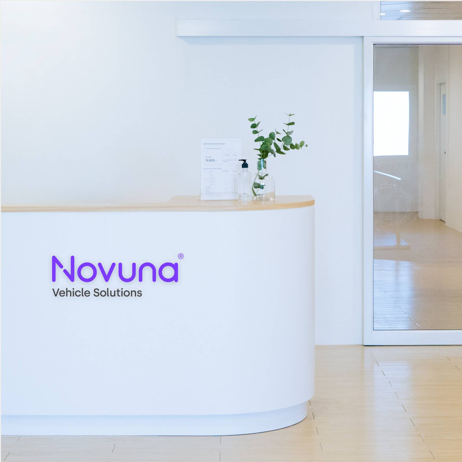
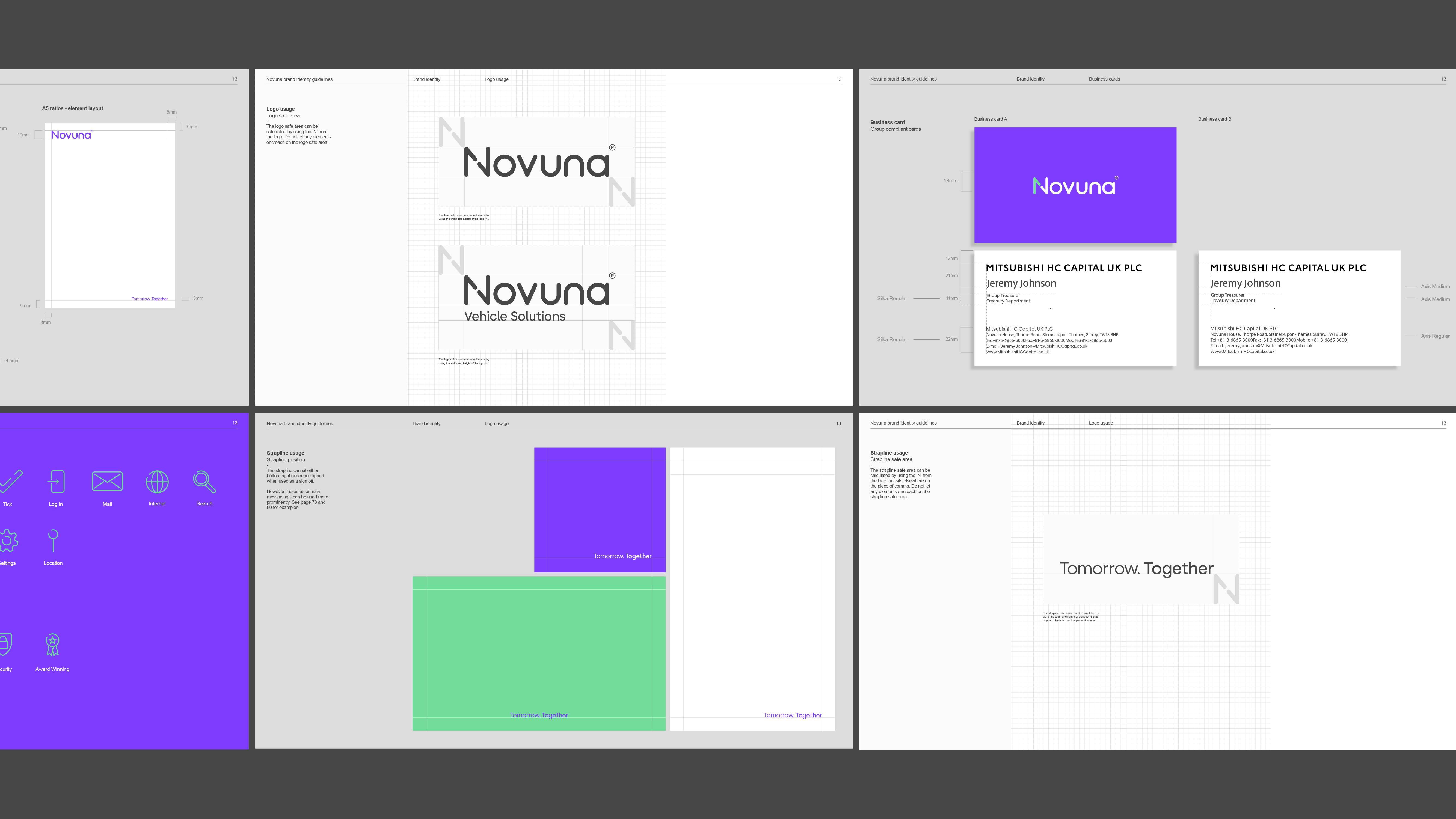
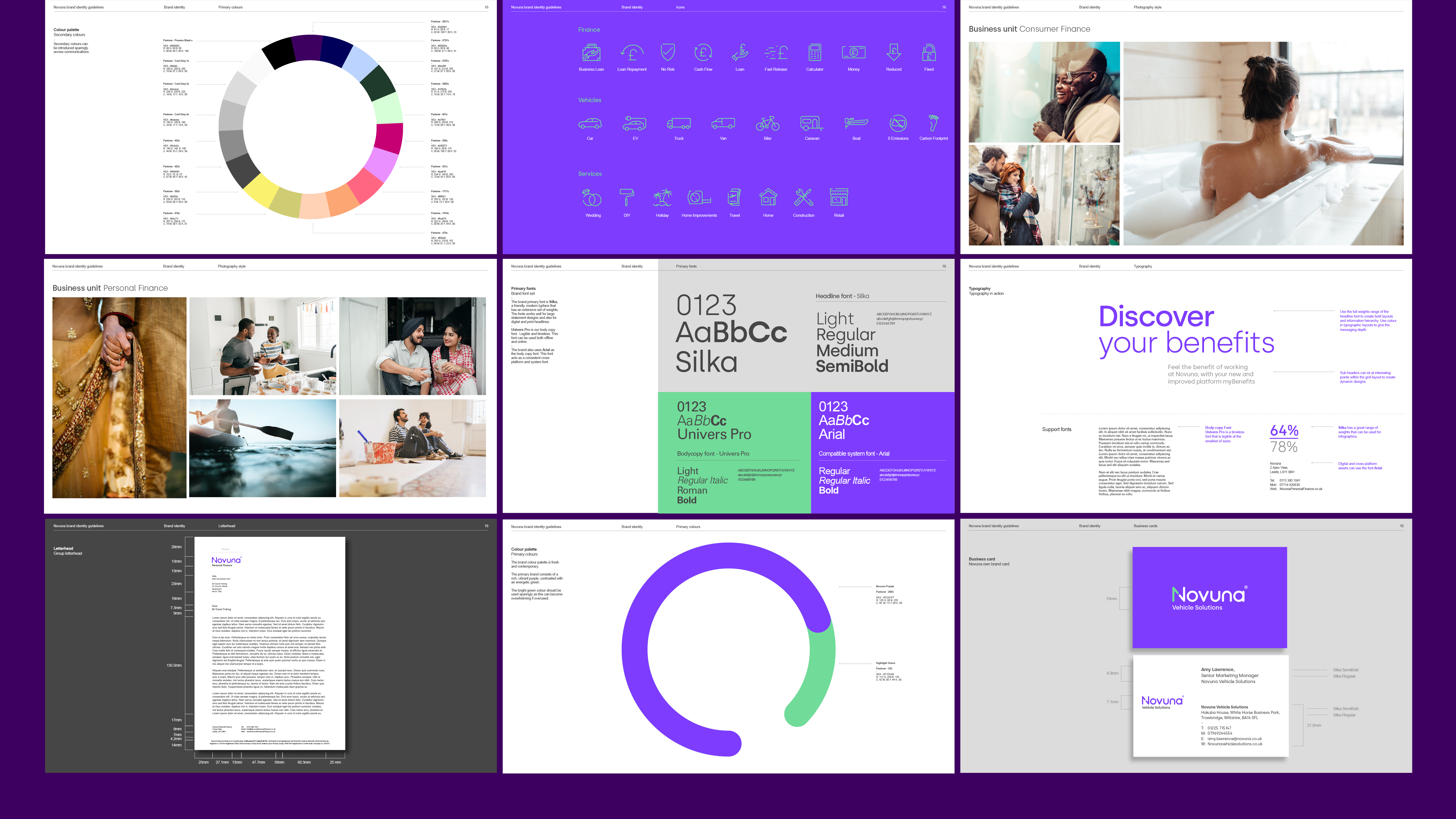
This combining of words also bled into the approach for the visual identity’s logomark. The lines that make up the ‘N’ of Novuna created a negative space intersection point where, figuratively, customers’ ambitions meet Novuna’s finance products.
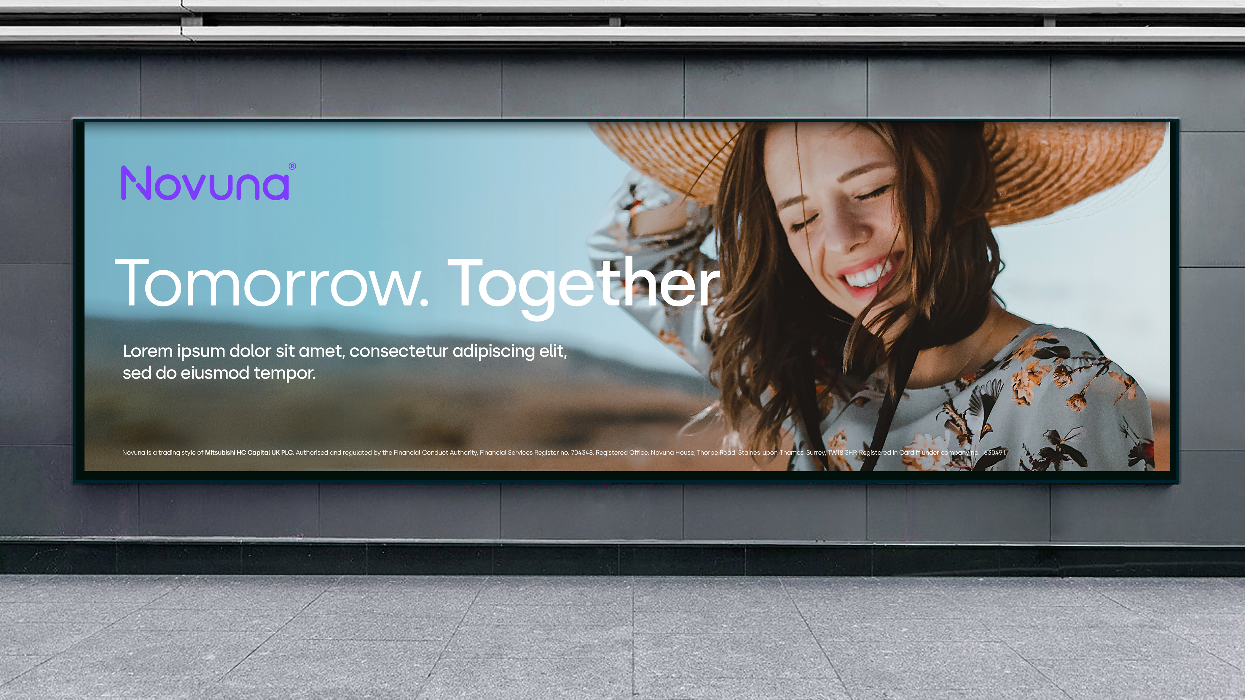
But as we all know a brand is not just a logo; Novuna’s brand had to show up at every customer interaction, whether online or in person. Everything has to flow seamlessly and feel like part of the same conversation.
As always for us, a brand is more than a veneer of pretty visuals, it was about creating a brand that’s bold, real, and resonates with everyone who encounters it.
The end result
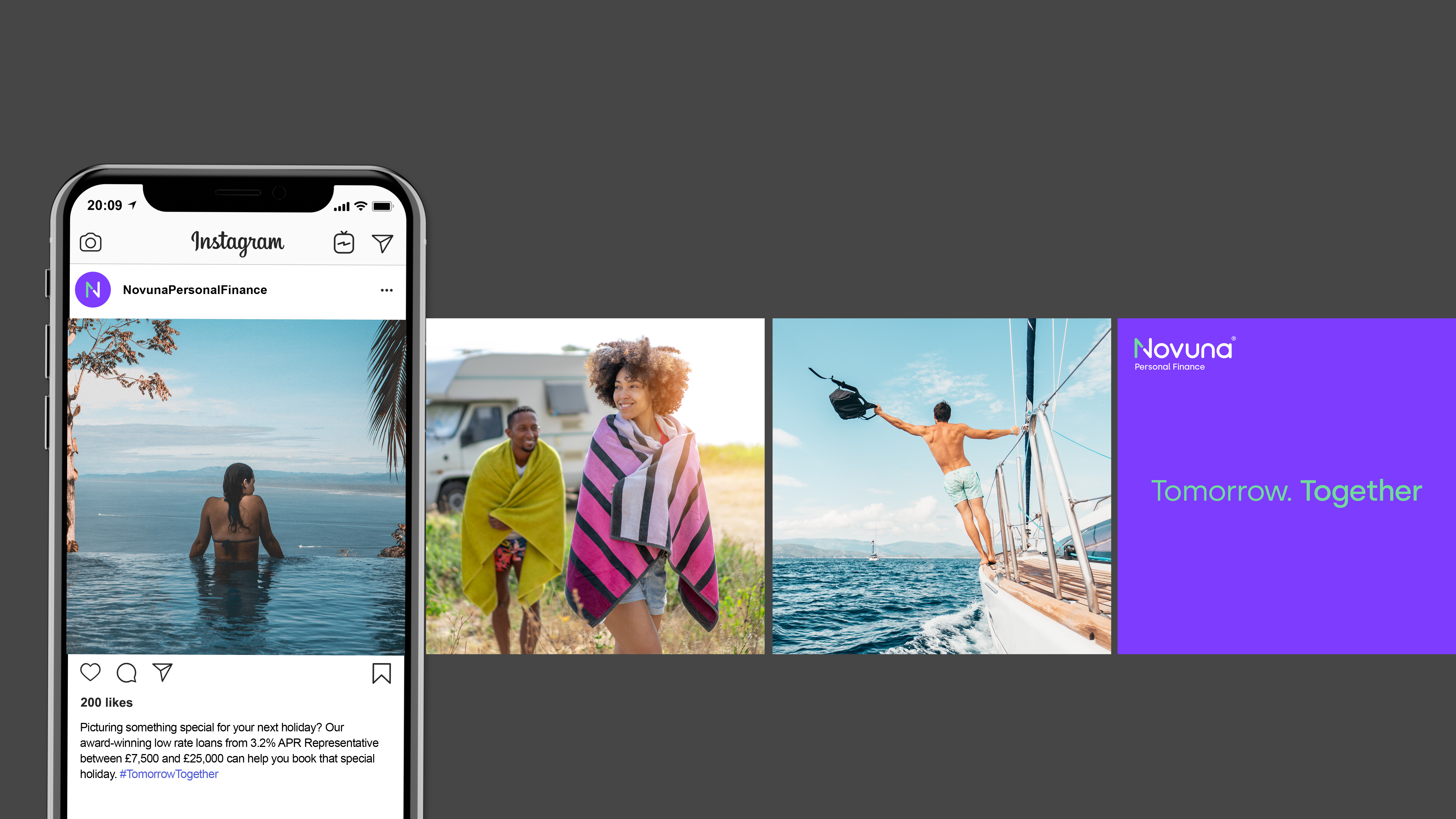
From the website and mobile apps, email templates and social media, to brochures and signage, and across the five sites in the UK and across their satellite offices in Europe, together we built a brand for one of the UK's most trusted finance providers.
Markets shift fast. And after 40 years of being one of the UK's most trusted finance providers, Hitachi Capital (UK) found itself in a landscape more crowded and competitive than ever. And with finance offerings flexing across multiple audiences, they needed a new name and identity that could fluidly fit everything from the business, personal, and vehicle finance sectors.
The craft
The name is a combination of Latin phraseology - ‘Nov’ derives from the Latin word ‘Novo’ which means ‘make new’ and ‘Una’ derives from the Latin word ‘Una’ which means ‘together’.
This combining of words also bled into the approach for the visual identity’s logomark. The lines that make up the ‘N’ of Novuna created a negative space intersection point where, figuratively, customers’ ambitions meet Novuna’s finance products.
But as we all know a brand is not just a logo; Novuna’s brand had to show up at every customer interaction, whether online or in person. Everything has to flow seamlessly and feel like part of the same conversation.
As always for us, a brand is more than a veneer of pretty visuals, it was about creating a brand that’s bold, real, and resonates with everyone who encounters it.
The end result
From the website and mobile apps, email templates and social media, to brochures and signage, and across the five sites in the UK and across their satellite offices in Europe, together we built a brand for one of the UK's most trusted finance providers.
Typefaces
Silka
We’ve developed a fantastic partnership with Studio Certain over the years, so when we were rebranding from Hitachi Capital UK PLC to Novuna, we chose their team to work with us to develop our new logo and brand identity, ensuring we had the foundations in place to embed the brand seamlessly, internally as well as externally, across all platforms. The rebranding involved a huge amount of work, but with the help of the team, we pulled it off and the results of the brand campaign have exceeded our expectations, with colleagues and our customers loving the brand.
Theresa Lindsay
Group Director of Marketing - Novuna
Group Director of Marketing - Novuna
More projects