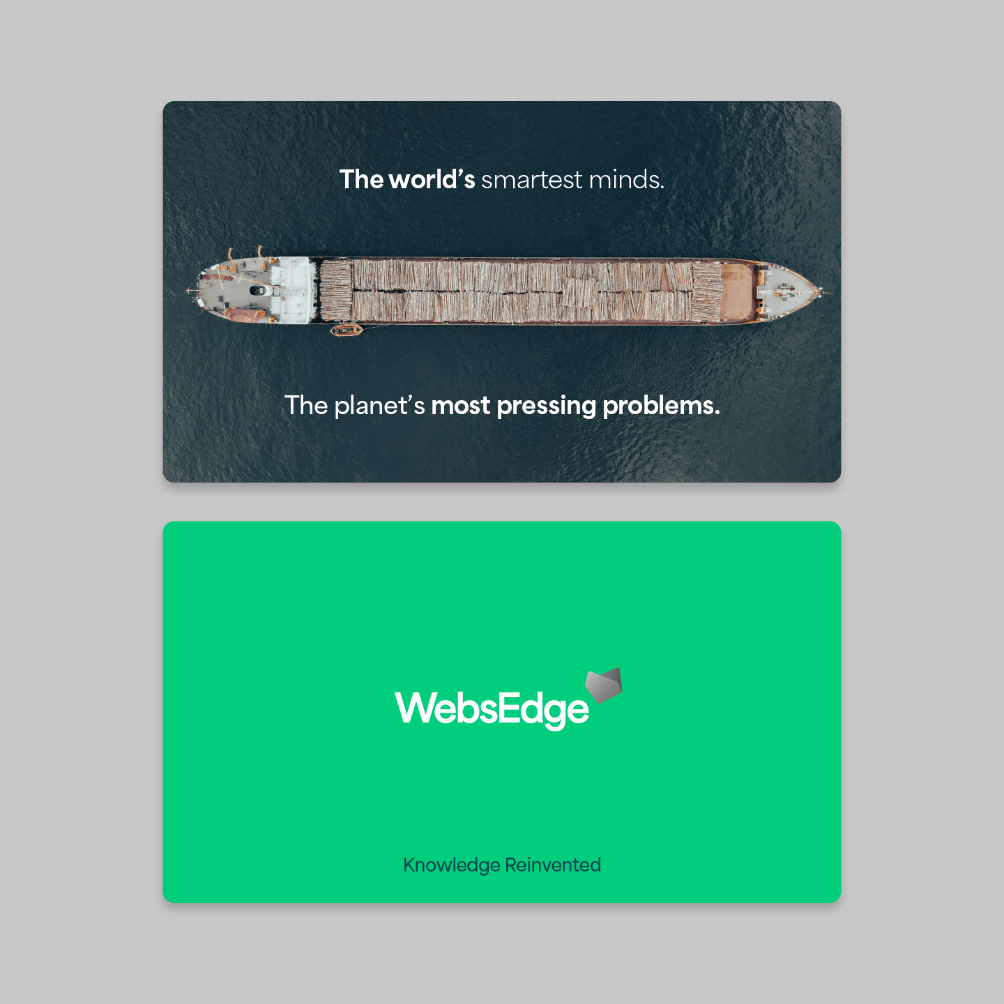
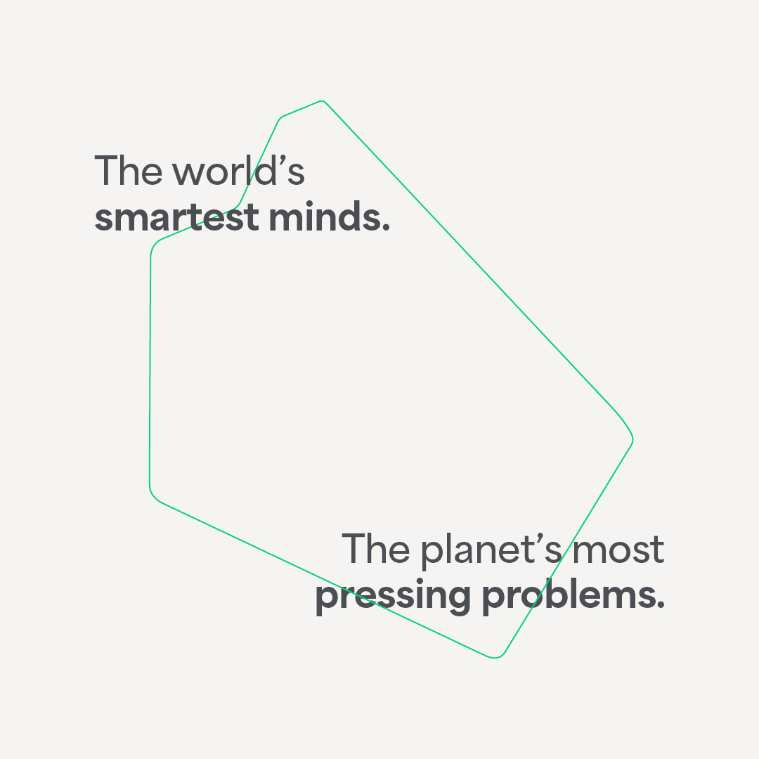
The world's smartest minds.
The planet's most pressing problems.
_Information is not knowledge. This was the statement that launched the project. Through a process of discovery and understanding, we redefined what it meant to be a global knowledge-driven media company.

Logomark
Visual identity
Brand messaging
Art direction
Brand rollout
Visual identity
Brand messaging
Art direction
Brand rollout
Project overview
Client
WebsEdge
Project undertaken
2024
Region
UK
Related
Sector
Technology
Disciplines
Logomark
Visual identity
Brand messaging
Art direction
Brand rollout
Visual identity
Brand messaging
Art direction
Brand rollout
Team
_Creative Direction
Steve Johnston
_Design
Dan Gurney
_Client team
Alice Lyons
Millie Jones
_Writing
Paul Irwin
Millie Jones
Steve Johnston
_Design
Dan Gurney
_Client team
Alice Lyons
Millie Jones
_Writing
Paul Irwin
Millie Jones
The context
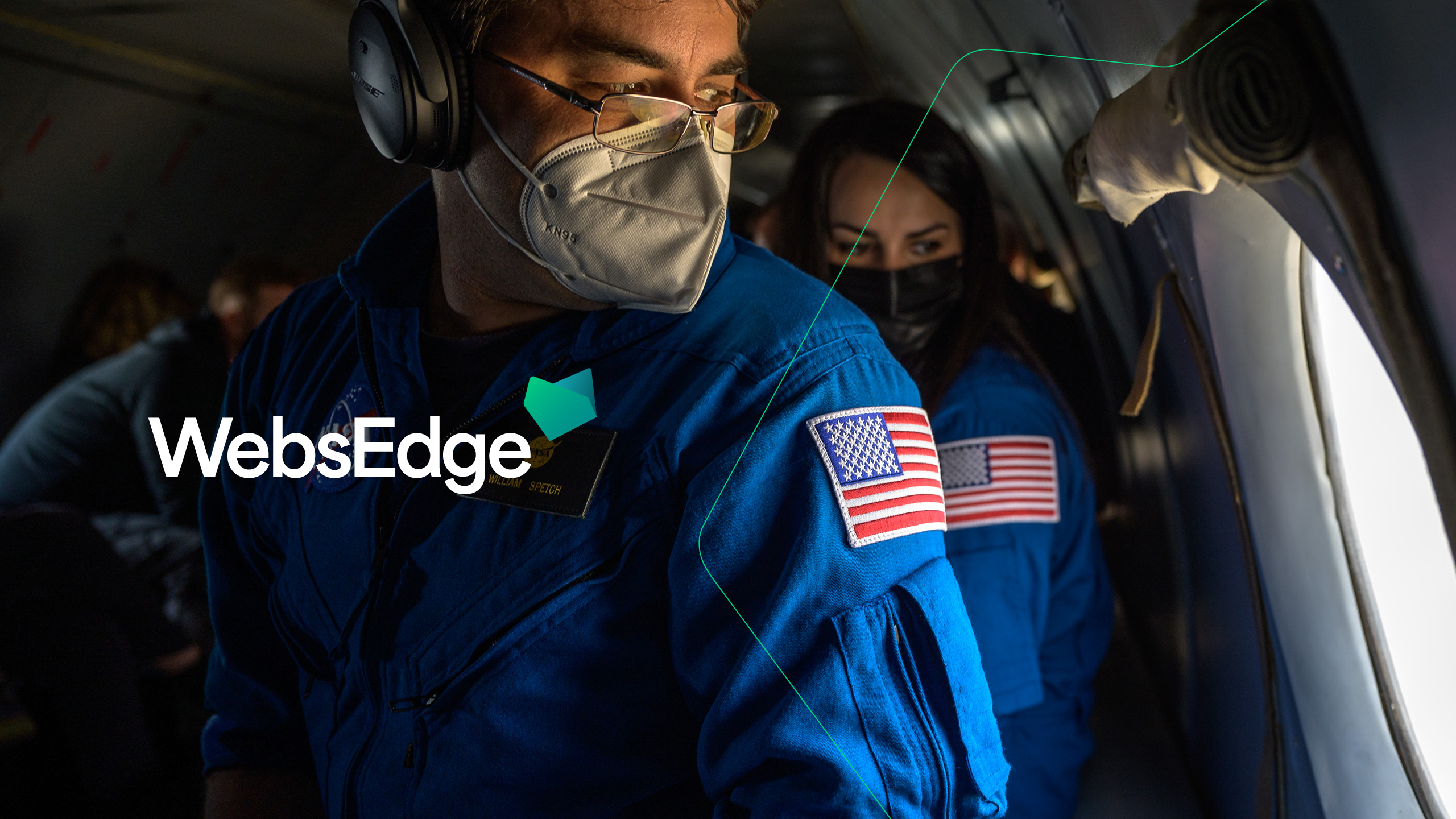
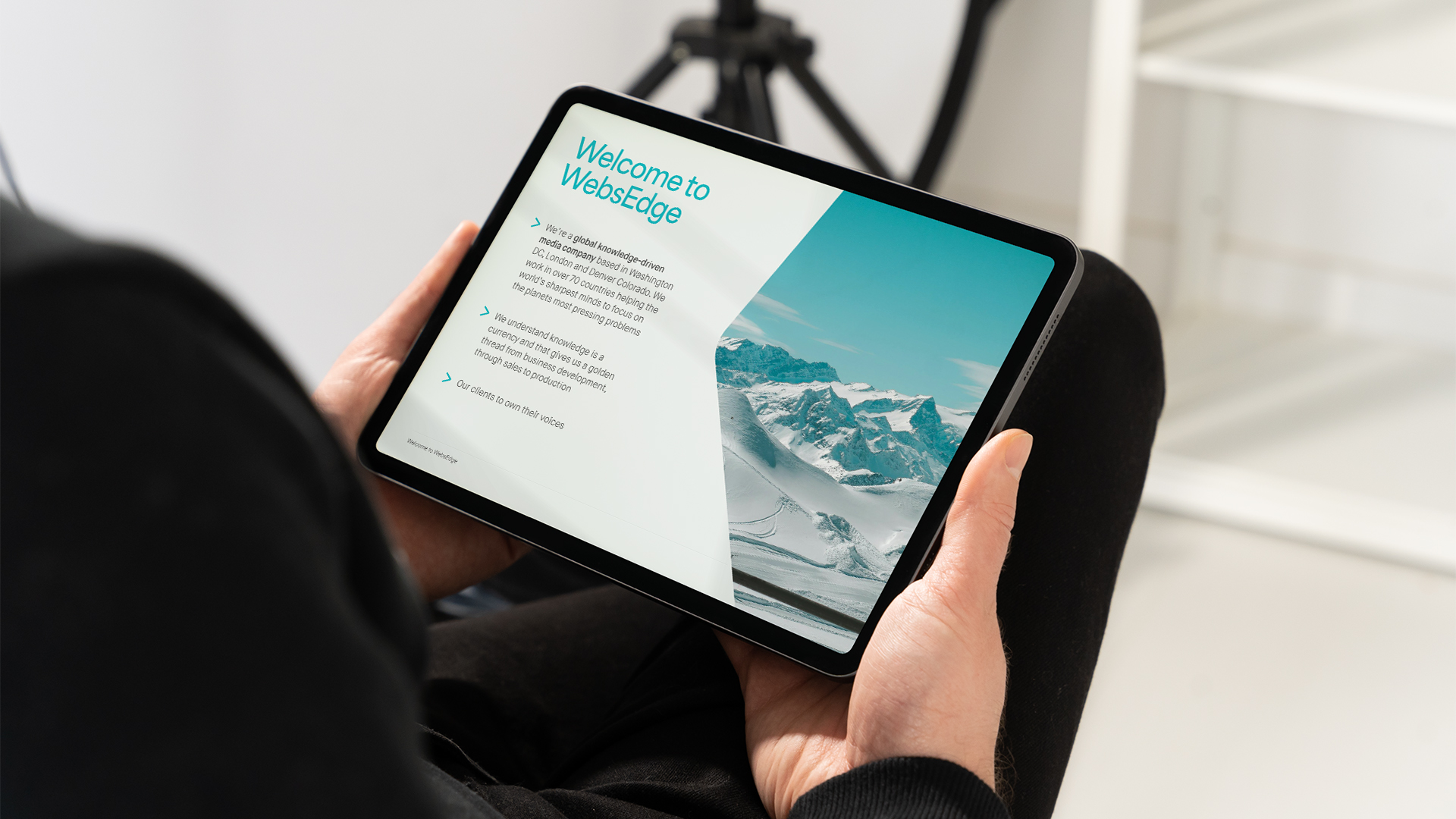
As an award-winning global knowledge-driven media company, WebsEdge specialises in creating and distributing thought leadership content in the fields of science, society, and medicine. But despite being at the forefront of global innovation, their brand was dated and their offering was convoluted and confusing. Our challenge was to create a new brand that verbally and visually encapsulated what they do, who they are, and who they aspired to be.
The craft
As the conduit for groundbreaking discoveries and debates, WebsEdge extract value from information and allow their clients, the world’s brightest minds, to own their voices. From quantum mechanics and stem cell regeneration to the future of global policing, the topics they cover are varied and vast.
So how do you begin to distil such an extensive ecosystem?
For us, it started with brand language. Or more simply, two words - Knowledge reinvented. Unpacking this brand positioning into a messaging framework allowed us to create a narrative that flexed across the full spectrum of sectors and specialisms.
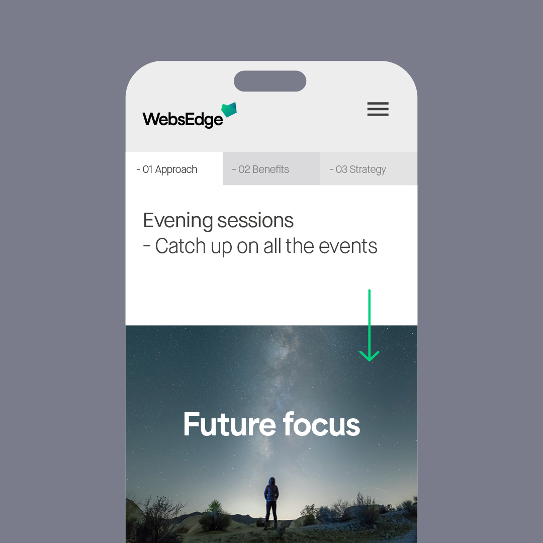
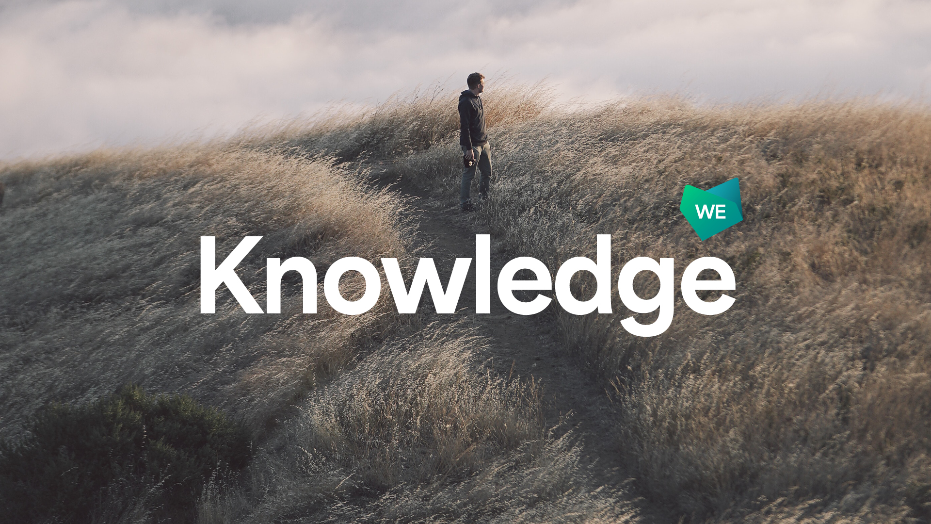
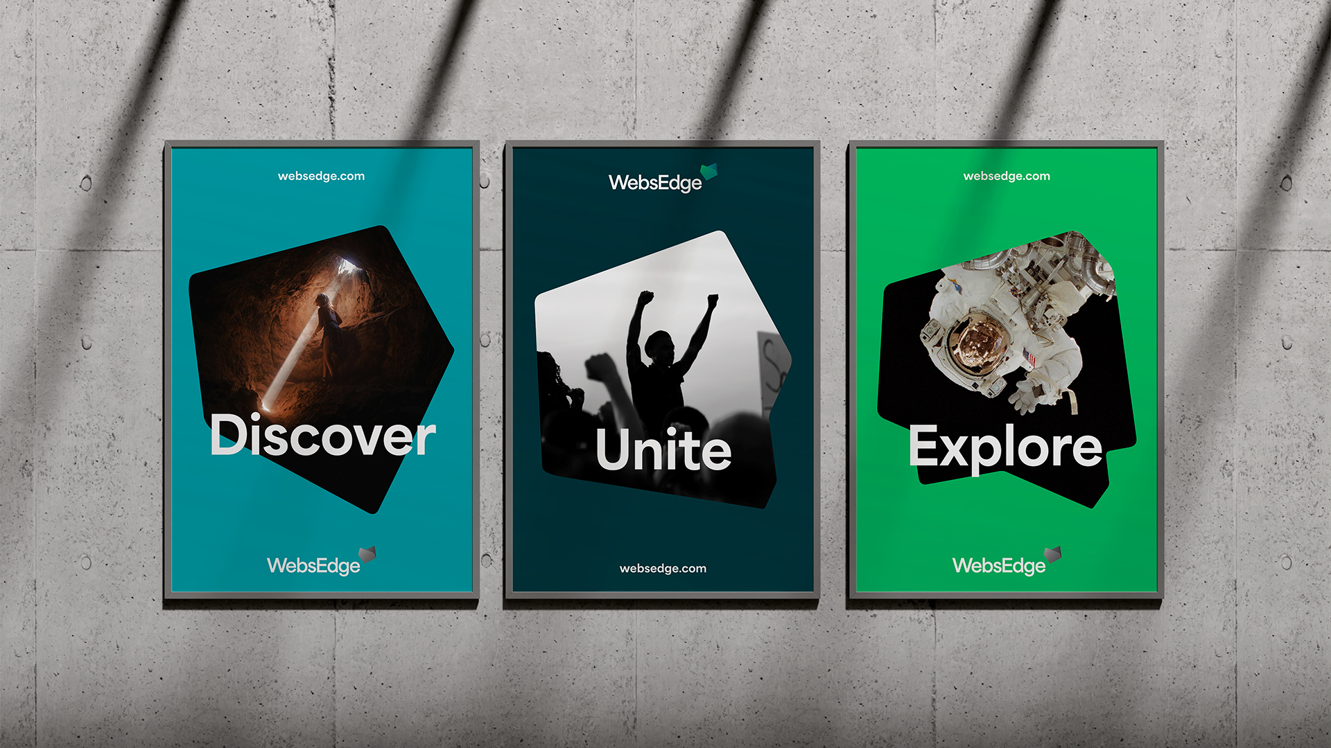
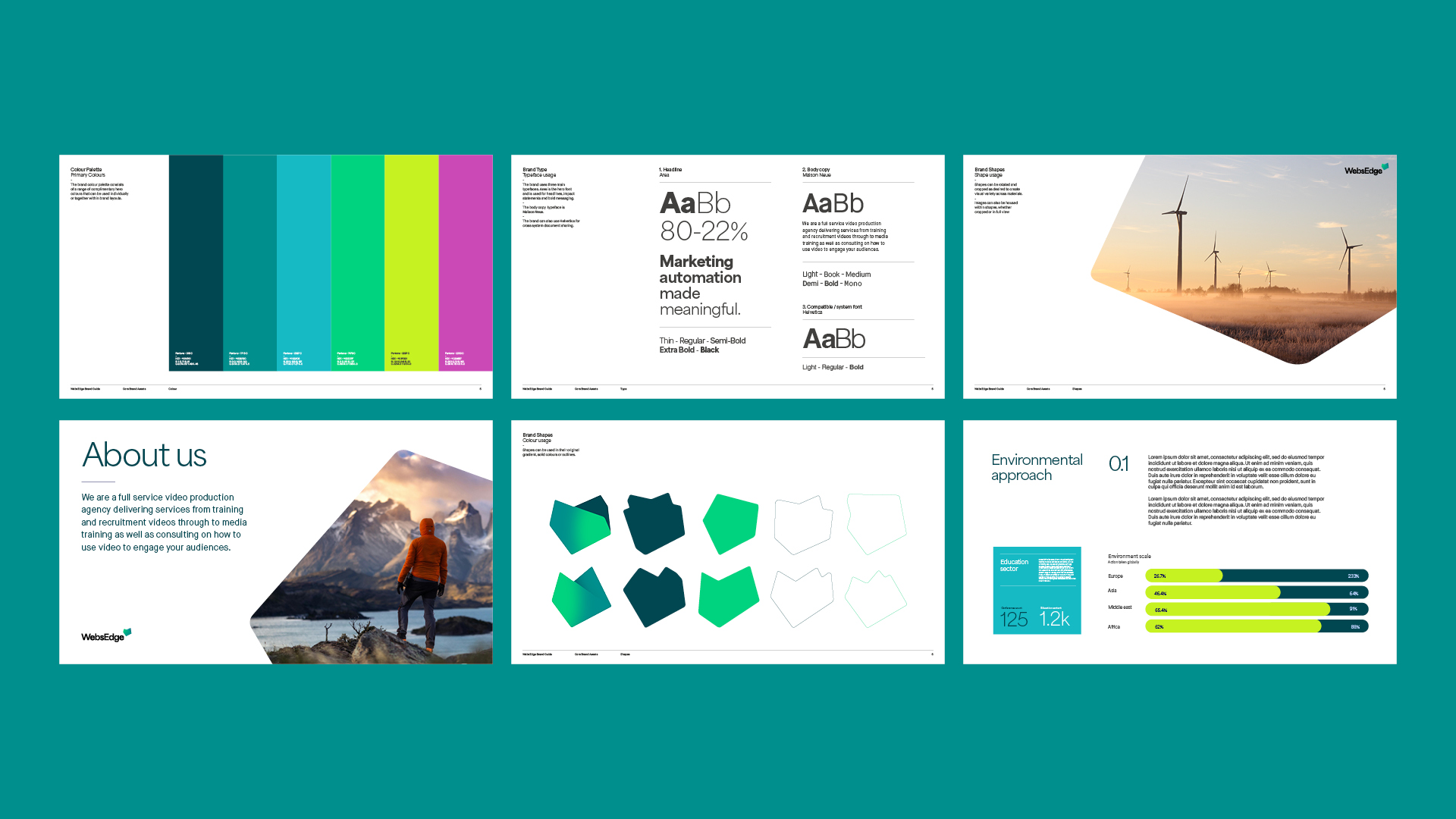
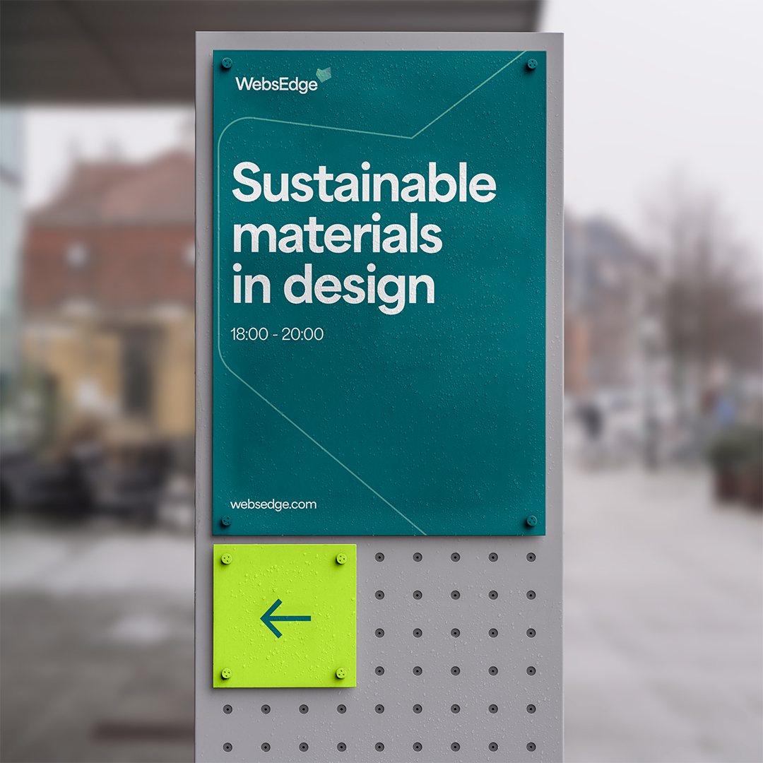
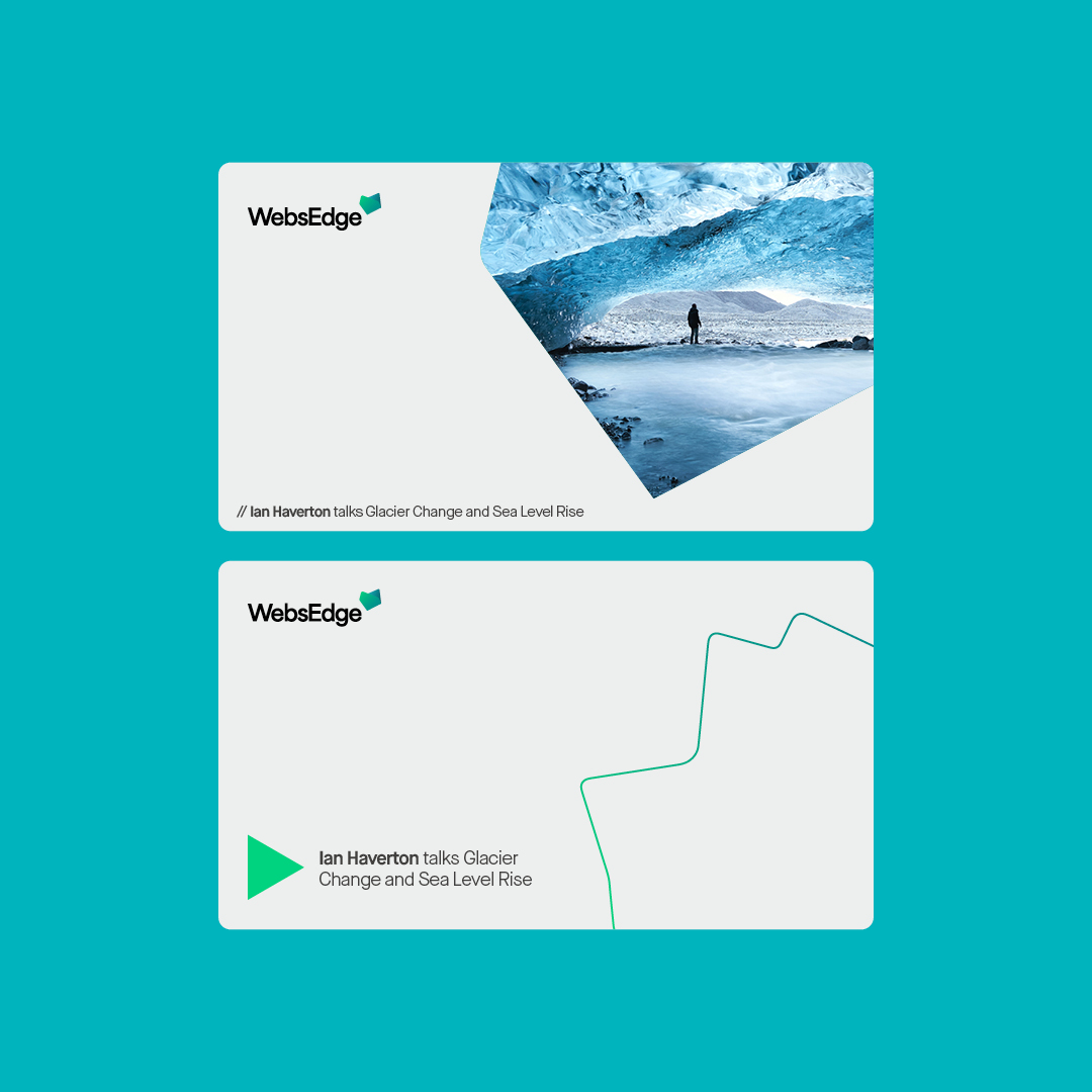
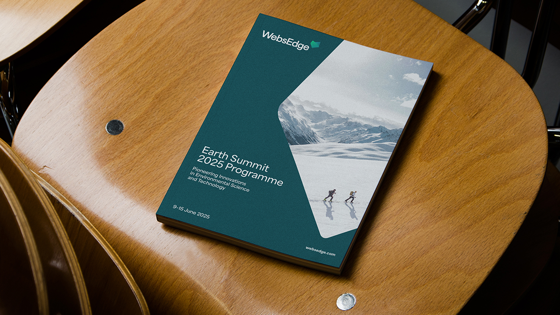
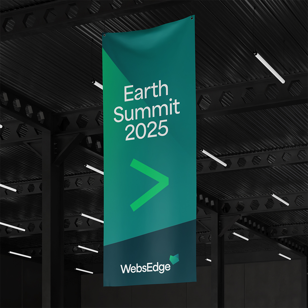
Versatility was also a must-have for the visual identity. It had to reflect WebsEdge’s mission to create an ever-evolving space that nurtures knowledge. We initially developed a rigid grid system to create a series of unique shapes tied to each sector. However, as the identity progressed, we realised a more fluid approach better fitted the brand’s fundamentals. The result was an ever-morphing graphic asset that shifts and reshapes to create variety in the visual vernacular while maintaining clarity and cohesion.
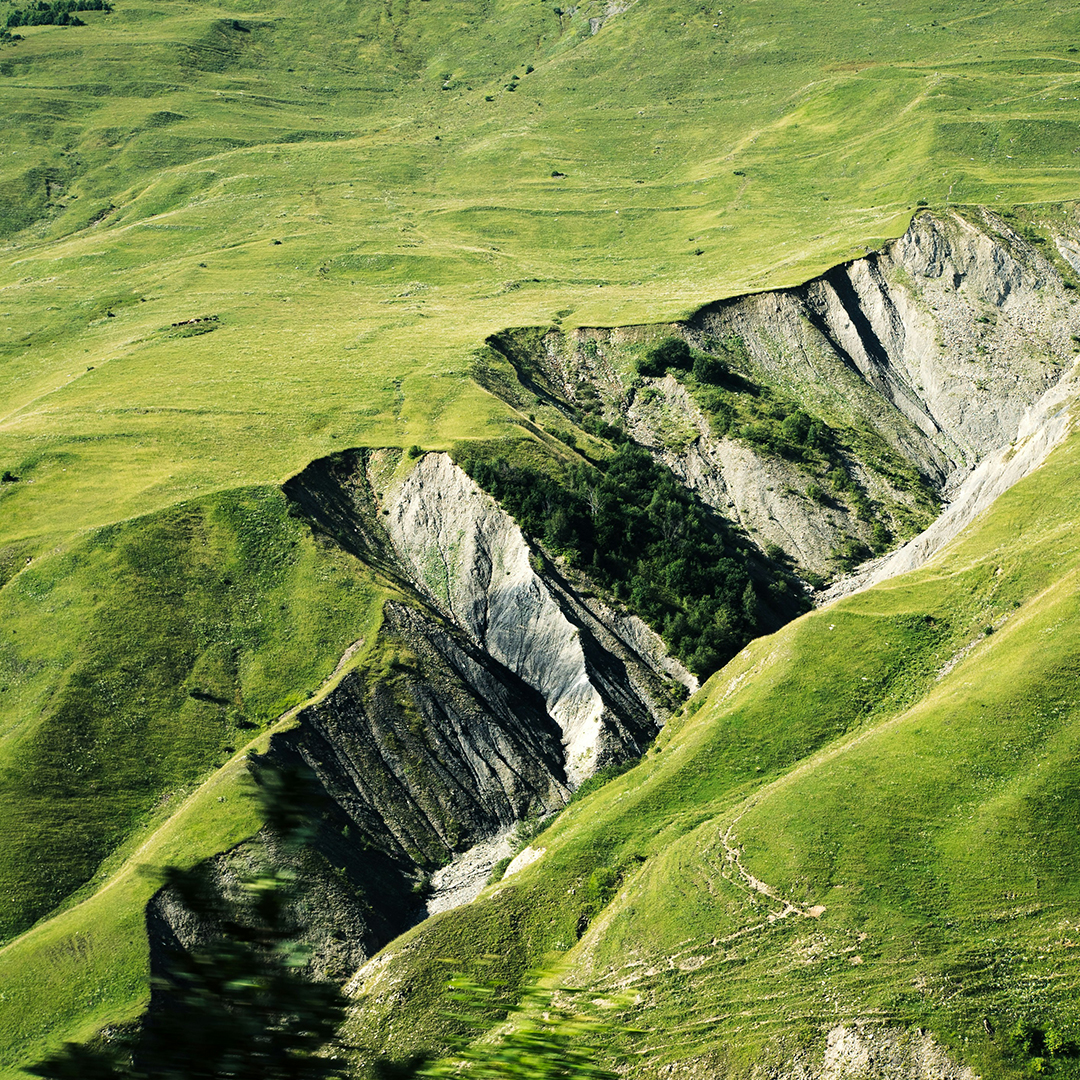
The colour palette we created consists of earthy hues to link to the physical world and punchier tones to forefront the impact that innovation and advancement is having upon it. Complementing the colour palette, the modular graphic device is also used as a window to house imagery, establishing WebsEdge as the lens through which we can learn about the world’s most pressing problems and the smartest minds solving them.
The end result
This radical reinvention equipped WebsEdge with a brand proposition and identity that matched the calibre of their content.
As an award-winning global knowledge-driven media company, WebsEdge specialises in creating and distributing thought leadership content in the fields of science, society, and medicine. But despite being at the forefront of global innovation, their brand was dated and their offering was convoluted and confusing. Our challenge was to create a new brand that verbally and visually encapsulated what they do, who they are, and who they aspired to be.
The craft
As the conduit for groundbreaking discoveries and debates, WebsEdge extract value from information and allow their clients, the world’s brightest minds, to own their voices. From quantum mechanics and stem cell regeneration to the future of global policing, the topics they cover are varied and vast.
So how do you begin to distil such an extensive ecosystem?
For us, it started with brand language. Or more simply, two words - Knowledge reinvented. Unpacking this brand positioning into a messaging framework allowed us to create a narrative that flexed across the full spectrum of sectors and specialisms.
Versatility was also a must-have for the visual identity. It had to reflect WebsEdge’s mission to create an ever-evolving space that nurtures knowledge. We initially developed a rigid grid system to create a series of unique shapes tied to each sector. However, as the identity progressed, we realised a more fluid approach better fitted the brand’s fundamentals. The result was an ever-morphing graphic asset that shifts and reshapes to create variety in the visual vernacular while maintaining clarity and cohesion.
The colour palette we created consists of earthy hues to link to the physical world and punchier tones to forefront the impact that innovation and advancement is having upon it. Complementing the colour palette, the modular graphic device is also used as a window to house imagery, establishing WebsEdge as the lens through which we can learn about the world’s most pressing problems and the smartest minds solving them.
The end result
This radical reinvention equipped WebsEdge with a brand proposition and identity that matched the calibre of their content.
Typefaces
Area
Maison Neue
Maison Neue
More projects