Complexity to clarity.
_Auditor PKF London wanted their own spin on their global parent’s visual identity. So we started with what the firm stood for and set about making that stand out. The key to success for this thoroughly complex and interesting challenge was creating an identity that would be recognisably individual, but suitably sympathetic at the same time.


Brand messaging
Visual identity
Art direction
Campaign
Motion
Website design
Brand rollout
Visual identity
Art direction
Campaign
Motion
Website design
Brand rollout


Project overview
Client
PKF Littlejohn
Project undertaken
2025
Region
UK
Related
Sector
Professional Services
Disciplines
Brand messaging
Visual identity
Art direction
Campaign
Motion
Website design
Brand rollout
Visual identity
Art direction
Campaign
Motion
Website design
Brand rollout
Team
_Creative Direction
Paul Irwin
_Design
Paul Irwin
Luke Farquharson
Dan Gurney
_Client team
Alice Lyons
Millie Jones
_Writing
Paul Irwin
Millie Jones
Paul Irwin
_Design
Paul Irwin
Luke Farquharson
Dan Gurney
_Client team
Alice Lyons
Millie Jones
_Writing
Paul Irwin
Millie Jones
The context
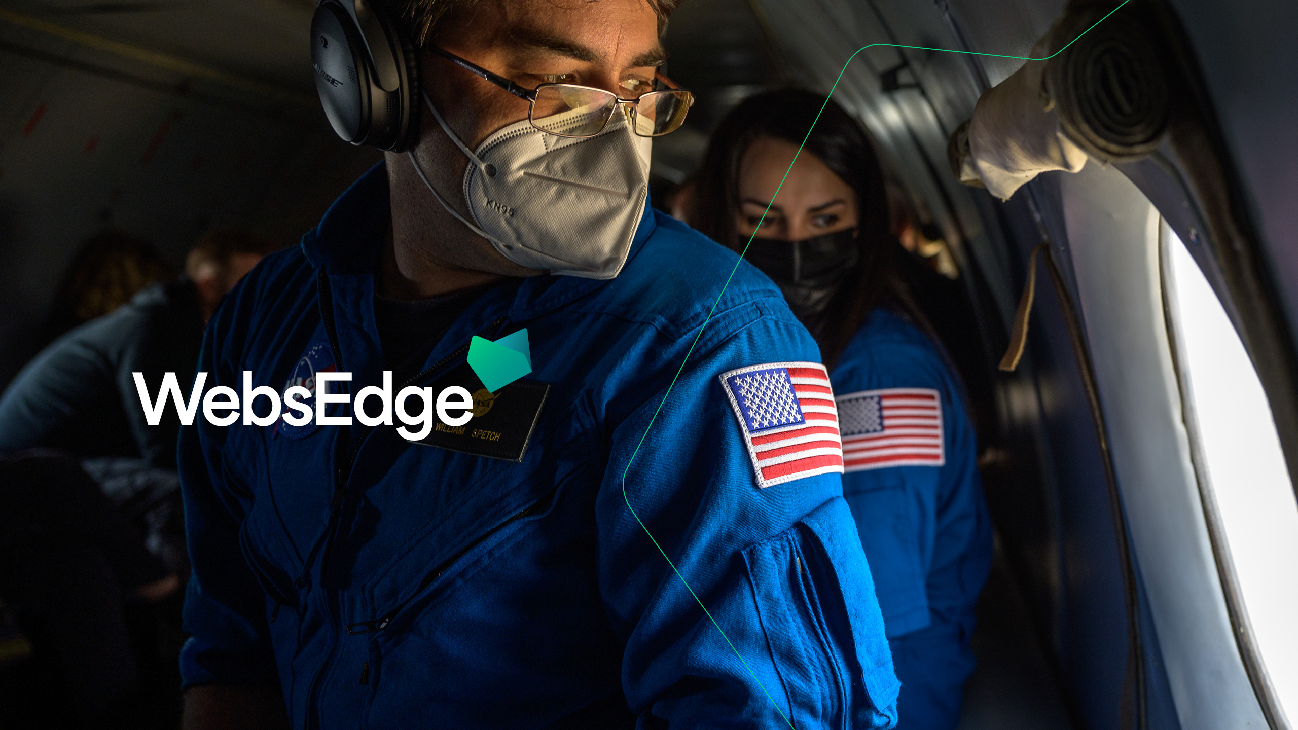
Since 2018, we've worked with PKF on projects big and small. As part of the global parent company rebrand project, each firm was given the opportunity to bring their own individuality to their visual identity, from their logo to their website and everything in between.
The craft
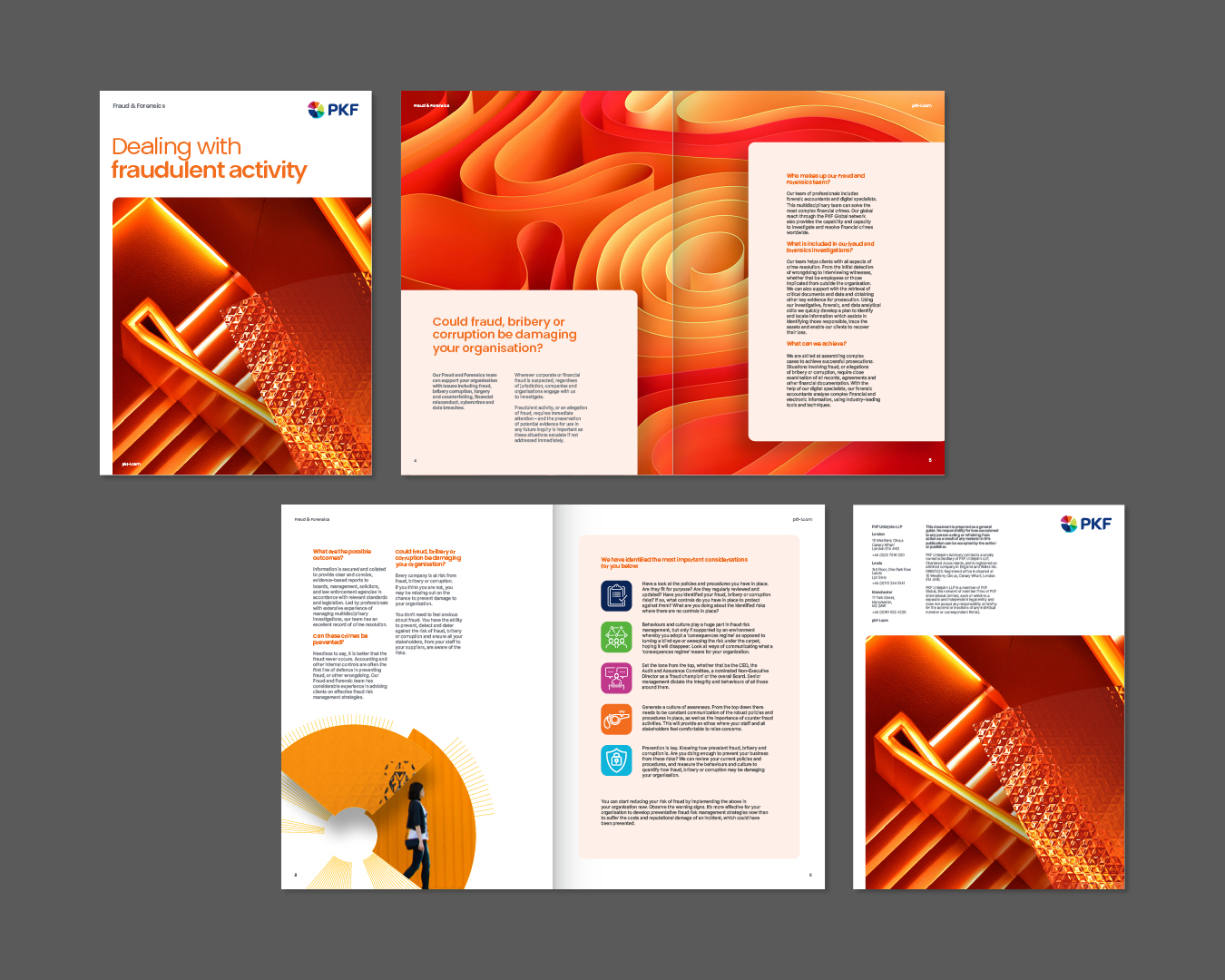
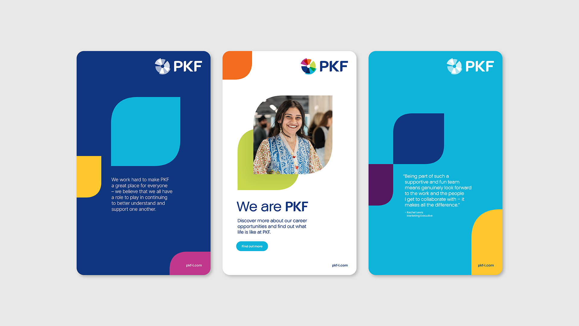
The first step in crafting a design system for the brand was visualising PKF Littlejohn’s unique proposition. To achieve this, we developed a complexity-to-simplicity filter, a concept that forms the cornerstone of the brand's hero style across most communications. Other design system elements included a starburst graphic device originating from the global parent brand. Through adaptation and expansion, we opened up the ways the device could be used to give them more freedom.
The next stop was art direction. We brought together authentic, people-first photography with abstract visuals that reflected the brand proposition, creating a distinctive and versatile image palette. With such a wide scope of communications to cover, the palette needed to offer both depth and adaptability, moving effortlessly across campaigns, channels, and content types.
From flagship brand touchpoints to everyday essentials, our design system had to be both robust and resonant with PKF's audience. The ultimate test? The website, one of the brand’s biggest and most visible assets. It challenged every element of the system to work in harmony, delivering a seamless experience across every device and screen size.
Motion plays a big role in how the visual identity of PKF flexes across its vast amount of touchpoints. We explored how each of the brand elements could move, both individually and together to create dynamic lockups. The principles were built on the brand's hero concept, using simplistic motion within complex compositions. This allowed the brand assets to do the heavy lifting whilst the motion elevated the content. We also created a motion standards toolkit that allowed their team to seamlessly create engaging content that was insightful, informative, professional and most importantly cohesive.
The end result
Rolled out across every conceivable touchpoint, this project was a complete brand rejuvenation that was both sympathetic to the global parent identity but instantly recognisable as PKF Littlejohn.
Since 2018, we've worked with PKF on projects big and small. As part of the global parent company rebrand project, each firm was given the opportunity to bring their own individuality to their visual identity, from their logo to their website and everything in between.
The craft
The first step in crafting a design system for the brand was visualising PKF Littlejohn’s unique proposition. To achieve this, we developed a complexity-to-simplicity filter, a concept that forms the cornerstone of the brand's hero style across most communications. Other design system elements included a starburst graphic device originating from the global parent brand. Through adaptation and expansion, we opened up the ways the device could be used to give them more freedom.
The next stop was art direction. We brought together authentic, people-first photography with abstract visuals that reflected the brand proposition, creating a distinctive and versatile image palette. With such a wide scope of communications to cover, the palette needed to offer both depth and adaptability, moving effortlessly across campaigns, channels, and content types.
From flagship brand touchpoints to everyday essentials, our design system had to be both robust and resonant with PKF's audience. The ultimate test? The website, one of the brand’s biggest and most visible assets. It challenged every element of the system to work in harmony, delivering a seamless experience across every device and screen size.
Motion plays a big role in how the visual identity of PKF flexes across its vast amount of touchpoints. We explored how each of the brand elements could move, both individually and together to create dynamic lockups. The principles were built on the brand's hero concept, using simplistic motion within complex compositions. This allowed the brand assets to do the heavy lifting whilst the motion elevated the content. We also created a motion standards toolkit that allowed their team to seamlessly create engaging content that was insightful, informative, professional and most importantly cohesive.
The end result
Rolled out across every conceivable touchpoint, this project was a complete brand rejuvenation that was both sympathetic to the global parent identity but instantly recognisable as PKF Littlejohn.
Typefaces
PKF Global Sans
Inter
Inter
It’s incredibly difficult to find an agency like Studio Certain that can do both strategy and creative to a high standard. The result is a brand that works at both the intellectual and emotion level, which is vital for us in the highly competitive industry in which we operate. I’m particularly impressed by their ability to come up with original ideas that consistently hit the mark. It makes working with them a pleasure as well as a learning experience!
Andrew Konieczko
Head of Brand & Communications - PKF
Head of Brand & Communications - PKF
More projects