Fighting the good fight.
_Operating in an untapped market, in a complex legislative landscape, without an established brand, is the perfect storm for being lost in the crowd of consumer communications. The solution to cut through? Create a clear and compelling brand narrative, a reimagined and refined visual identity, and a sleek and sophisticated digital presence that firmly positions Ryland Bell as a legitimate entity intent on righting the wrongs of insolvency.

Brand narrative
Tone of voice
Logomark
Visual identity
Website design
Brand rollout
Tone of voice
Logomark
Visual identity
Website design
Brand rollout


Project overview
Client
Ryland Bell
Project undertaken
2025
Region
UK
Related
Sector
Professional Services
Disciplines
Brand narrative
Tone of voice
Logomark
Visual identity
Website design
Brand rollout
Tone of voice
Logomark
Visual identity
Website design
Brand rollout
Team
_Creative Direction
Steve Johnston
_Design
Dan Gurney
_Client team
Alice Lyons
Chloe Bates
_Writing
Paul Irwin
Millie Jones
Steve Johnston
_Design
Dan Gurney
_Client team
Alice Lyons
Chloe Bates
_Writing
Paul Irwin
Millie Jones
The context
Ryland Bell is writing its own chapter as the only insolvency debt recovery specialist in the UK. And when your mission is to hold company directors with a history of serial insolvency accountable for their actions, you need a brand that's ready for the fight.
The craft
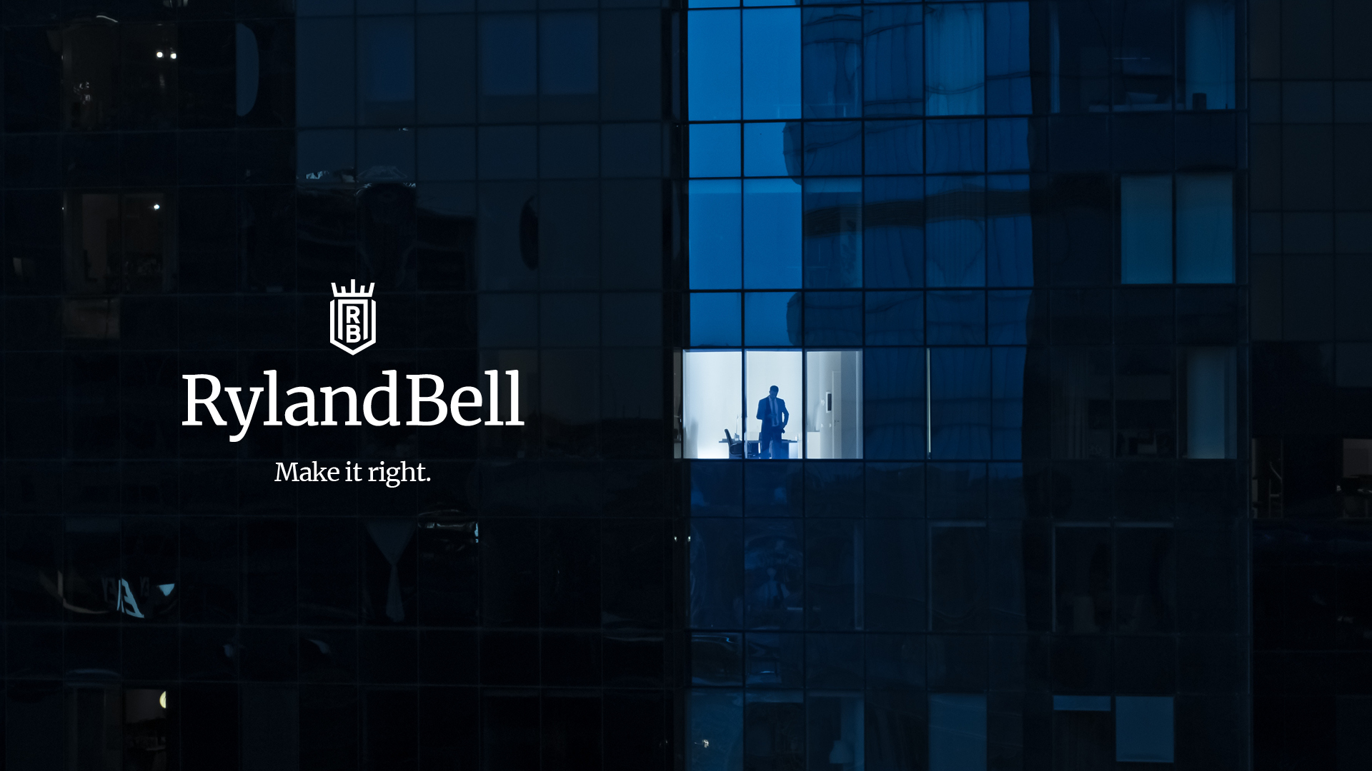
With a name drawn from the archives and the bringing together of two of the pioneers of the Birmingham law society's storied history, Ryland Bell's new brand had to emanate authenticity, ensure authority, and establish approachability.
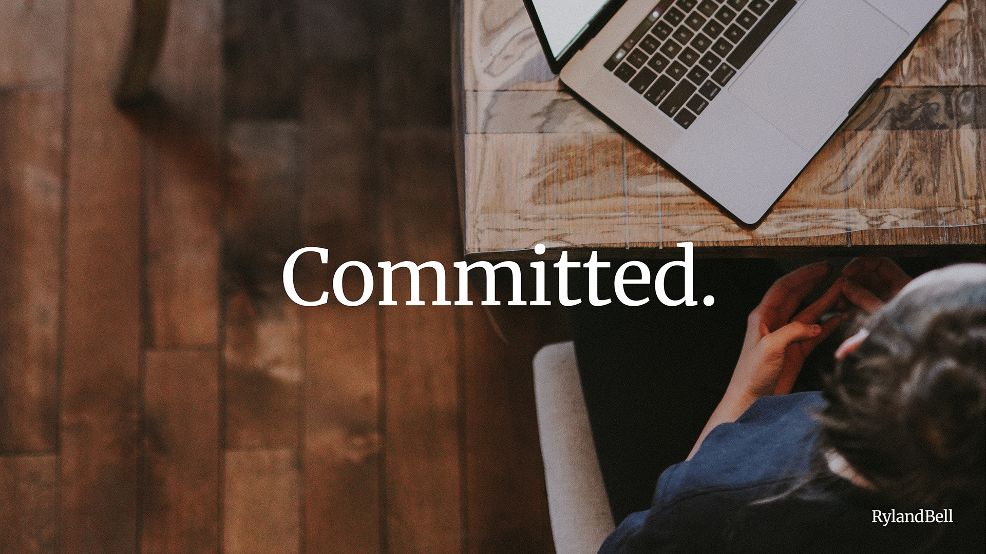
Starting with the narrative, we first decoded and defined their values. We synthesised their transparent approach, practical proficiency, dedication, and proven track record into three words - Honest, Pragmatic, and Committed. With this as our foundation, we moved to redefine their proposition, process, and purpose, ensuring simplicity and salience.
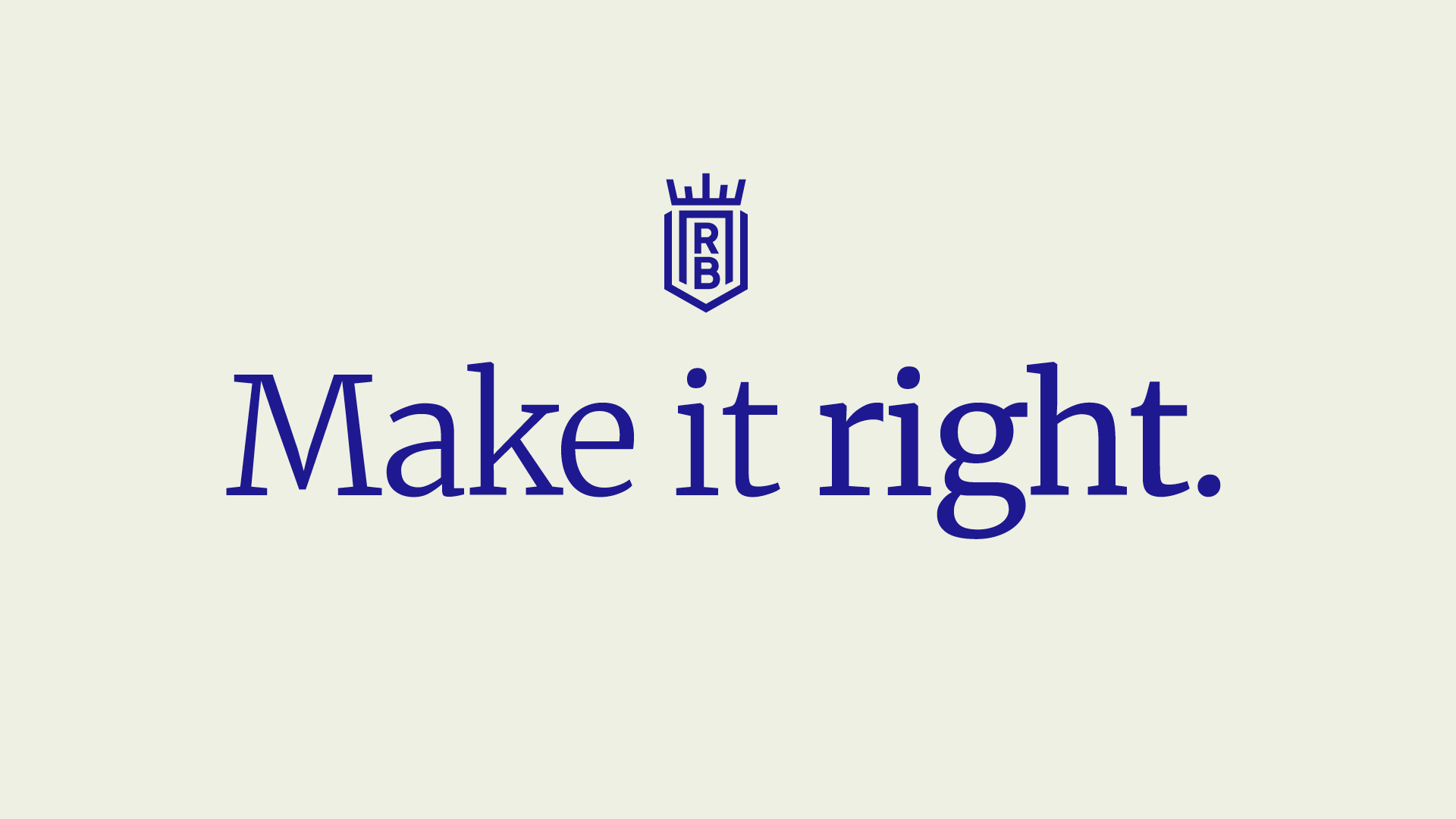
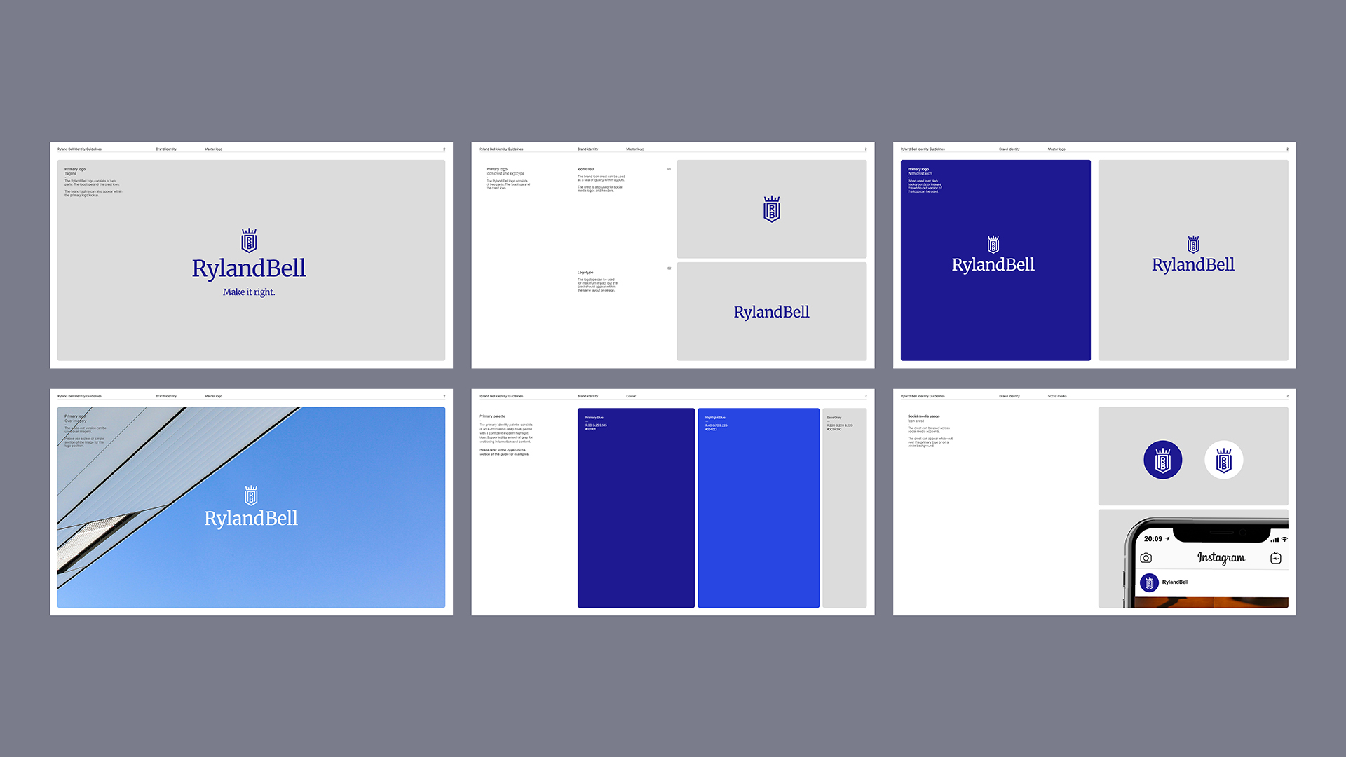
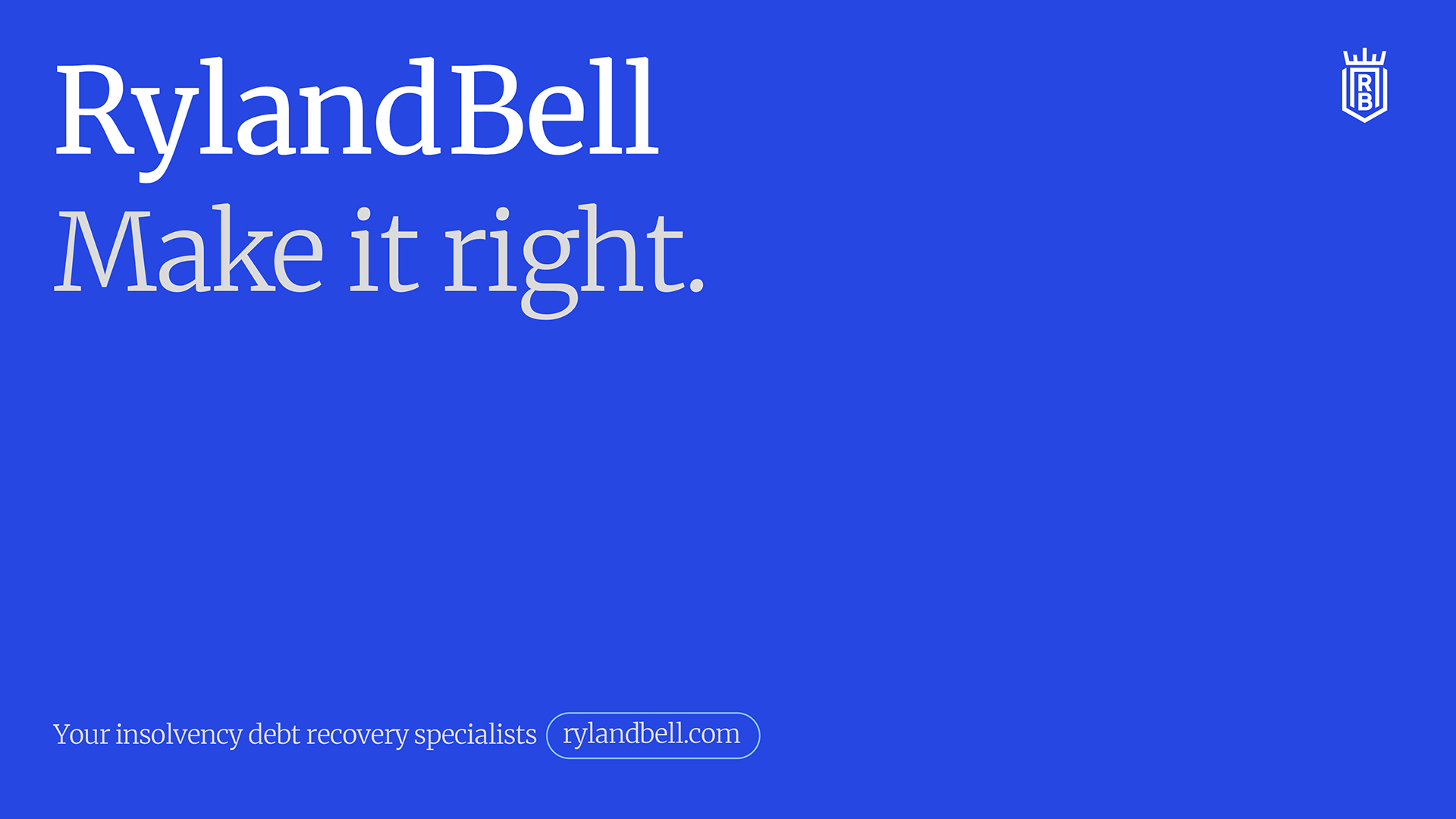
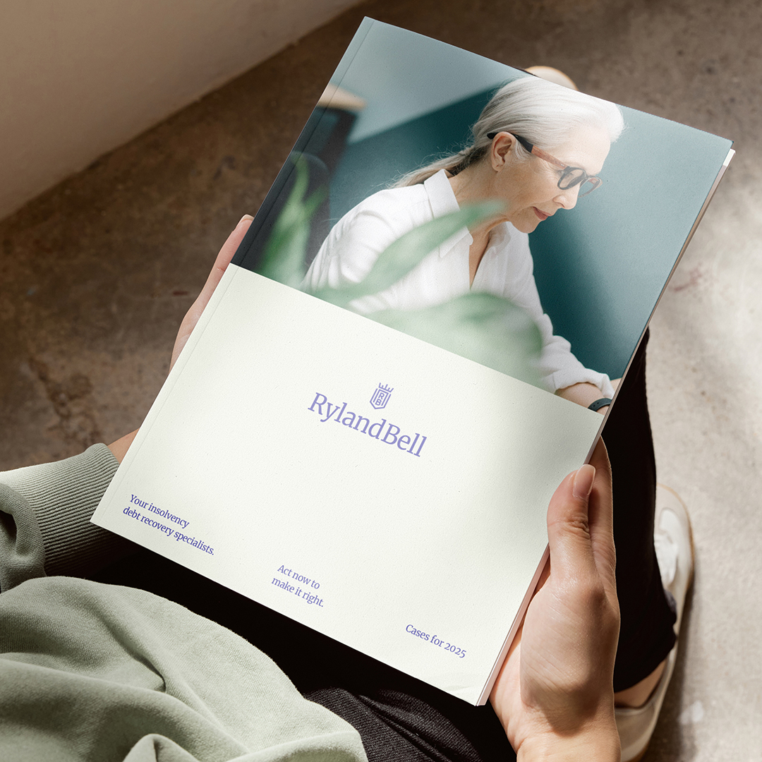
For the visual identity, a classic crest with a contrasting contemporary serif font and clean geometric lines connects the history of the name with the cutting-edge approach of the business. Combined with the hero blue, which is both refined and reassuring, and the secondary palette, whose pastel and poppy hues lend a warm and personable contrast, the brand quickly became authoritative and approachable.
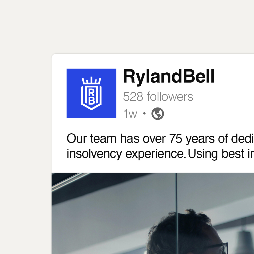
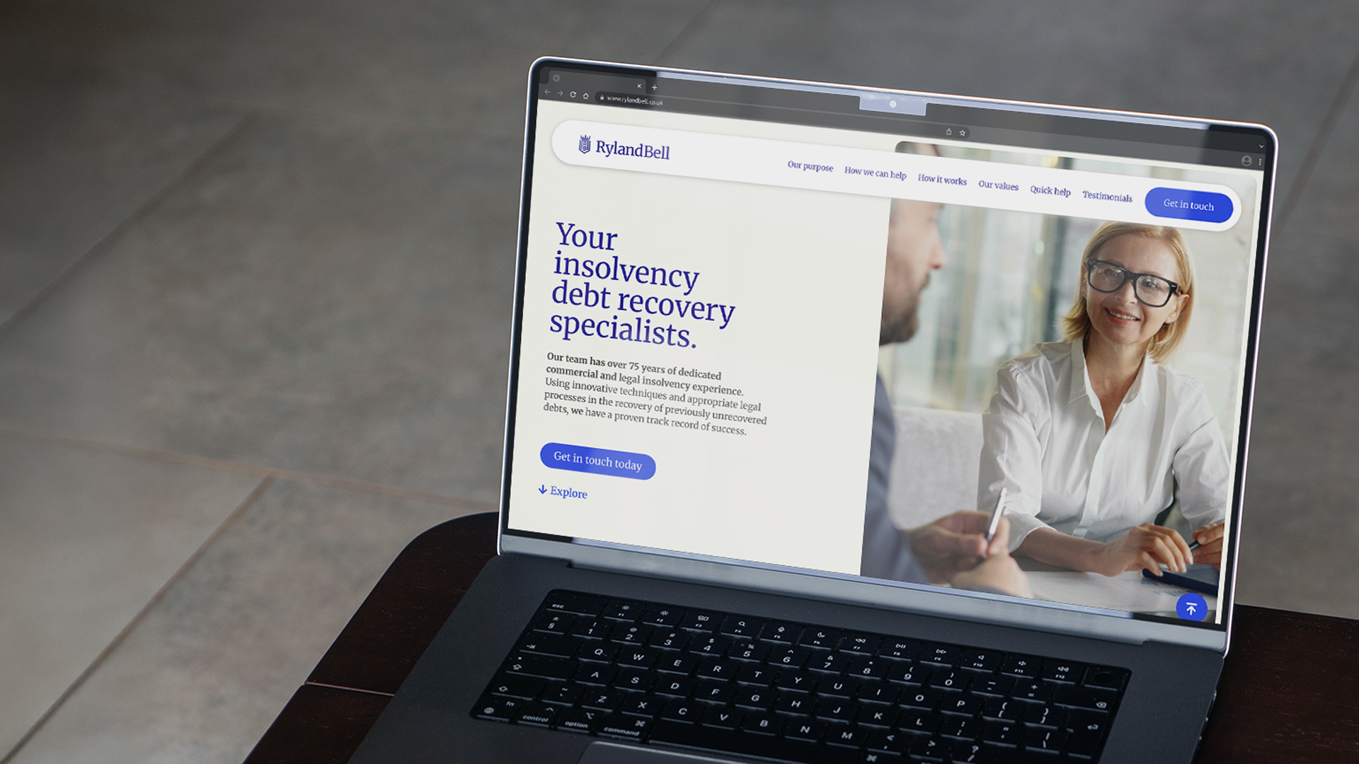
When translating this into the digital space, we dialed up the human element of Ryland Bell’s approach by prioritising people-based imagery. Pairing this with a simple UI and intuitive UX, prospective leads can navigate the site and find the information they need with ease and efficiency.
The end result
Now with instant credibility and authority, Ryland Bell took their brand to market with the assurance of being able to gain trust with their target market, and in turn, grow their business.
Ryland Bell is writing its own chapter as the only insolvency debt recovery specialist in the UK. And when your mission is to hold company directors with a history of serial insolvency accountable for their actions, you need a brand that's ready for the fight.
The craft
With a name drawn from the archives and the bringing together of two of the pioneers of the Birmingham law society's storied history, Ryland Bell's new brand had to emanate authenticity, ensure authority, and establish approachability.
Starting with the narrative, we first decoded and defined their values. We synthesised their transparent approach, practical proficiency, dedication, and proven track record into three words - Honest, Pragmatic, and Committed. With this as our foundation, we moved to redefine their proposition, process, and purpose, ensuring simplicity and salience.
For the visual identity, a classic crest with a contrasting contemporary serif font and clean geometric lines connects the history of the name with the cutting-edge approach of the business. Combined with the hero blue, which is both refined and reassuring, and the secondary palette, whose pastel and poppy hues lend a warm and personable contrast, the brand quickly became authoritative and approachable.
When translating this into the digital space, we dialed up the human element of Ryland Bell’s approach by prioritising people-based imagery. Pairing this with a simple UI and intuitive UX, prospective leads can navigate the site and find the information they need with ease and efficiency.
The end result
Now with instant credibility and authority, Ryland Bell took their brand to market with the assurance of being able to gain trust with their target market, and in turn, grow their business.
Typefaces
Merriweather
Inter
Inter
More projects