A new leader in student living is Here!
_How do you create a student living brand that connects with students across campuses, cultures, and countries? That was the challenge that Generation Estates brought to us as they expanded their UK portfolio. The answer? A bold, modular identity built on community, accessibility, and sustainability.
Naming
Brand messaging
Visual identity
Logomark
Art direction
Motion
Website design
Brand rollout
Wayfinding
Brand messaging
Visual identity
Logomark
Art direction
Motion
Website design
Brand rollout
Wayfinding


Project overview
Client
Generation Estates
Project undertaken
2021
Region
UK
Related
Sector
Property
Disciplines
Naming
Brand messaging
Visual identity
Logomark
Art direction
Motion
Website design
Brand rollout
Wayfinding
Brand messaging
Visual identity
Logomark
Art direction
Motion
Website design
Brand rollout
Wayfinding
Team
_Creative Direction
Steve Johnston
_Design
Paul Irwin
Ellen Teale
Luke Farquharson
_Client team
Alice Lyons
_Writing
Paul Irwin
Steve Johnston
_Design
Paul Irwin
Ellen Teale
Luke Farquharson
_Client team
Alice Lyons
_Writing
Paul Irwin
The context
Generation Partners is a market leading developer, operator, asset and fund manager of alternative real estate assets. With a specific focus on PBSA, they saw an opportunity to create a brand for their unique and engaging community environments that are reflective of today’s students. Our challenge? To create a student accommodation brand that could span across global markets, resonating and attracting both UK and China-based students.
The craft
Kickstarting the project with a brand value proposition workshop, we pinpointed the current and future target audiences, and discussed how Generation wanted this brand to feel, compared to the rest of their portfolio. This formed the basis of our naming workshops, and with territories explored, names stress-tested, we pushed all possibilities until the right answer emerged.
But this was more than a naming exercise. It was a cross-cultural branding challenge that required sensitivity, strategy, and creativity in equal measure. The brand needed to be instantly understandable and emotionally resonant across diverse linguistic and cultural backgrounds. China was a primary focus – brand perception there is deeply influenced by language, symbolism, and colour. Specific care was taken to avoid negative linguistic or symbolic associations, while ensuring the name and identity carried positive connotations of belonging, connection, and success.
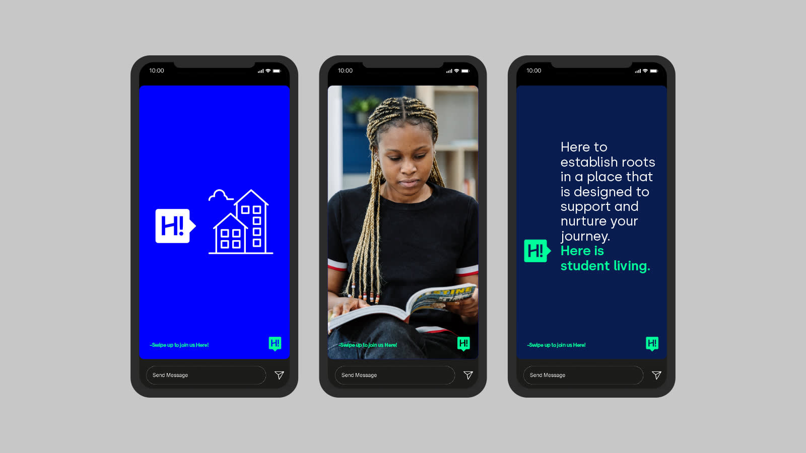
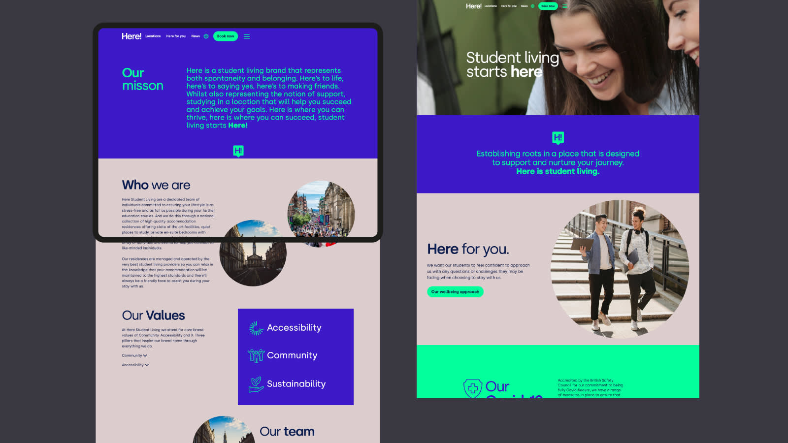
Given the guiding principle behind the spaces themselves, which Generation wanted to feel like ‘home away from home’ for the students, only one name felt right. Here. Representing both spontaneity and belonging, the name then became the driving force behind the brand messaging - Live here, Grow here, Thrive here, The next step is here, Meet new people here, Feel supported here, Your home from home is here.
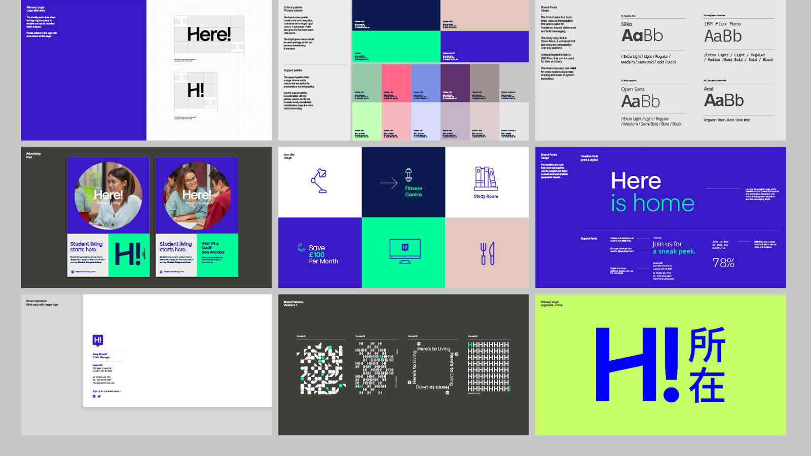
The wordmark creates a little smile in the mind, by using the bottom negative space of the capital ‘H’ to hint at a home like structure and the exclamation mark adds impact and immediacy to the ident.
When it came to colours we needed a palette that was punchy and distinctive. A bright screen blue paired with a neon lime formed the primary brand colours that spoke to the spontaneity of the brand and a complimentary suite of pastels to allow for moments of calm and belonging.
In terms of art direction, photography became our lens into this elevated student living where authenticity meets aspiration without compromising either. The goal was always to showcase the premium quality of the environments while celebrating the genuine interactions that happen within them.
The end result
Built from the ground up and rolled out across their portfolio, Here! is one of Generation Estates flagship PBSA brands. From first website visit to fresher’s week, welcome packs to wayfinding, the brand flexed across every touchpoint. Our robust brand guidelines empowered Generation Partner’s internal teams to maintain consistency while allowing flexibility for each city and each demographic.
Generation Partners is a market leading developer, operator, asset and fund manager of alternative real estate assets. With a specific focus on PBSA, they saw an opportunity to create a brand for their unique and engaging community environments that are reflective of today’s students. Our challenge? To create a student accommodation brand that could span across global markets, resonating and attracting both UK and China-based students.
The craft
Kickstarting the project with a brand value proposition workshop, we pinpointed the current and future target audiences, and discussed how Generation wanted this brand to feel, compared to the rest of their portfolio. This formed the basis of our naming workshops, and with territories explored, names stress-tested, we pushed all possibilities until the right answer emerged.
But this was more than a naming exercise. It was a cross-cultural branding challenge that required sensitivity, strategy, and creativity in equal measure. The brand needed to be instantly understandable and emotionally resonant across diverse linguistic and cultural backgrounds. China was a primary focus – brand perception there is deeply influenced by language, symbolism, and colour. Specific care was taken to avoid negative linguistic or symbolic associations, while ensuring the name and identity carried positive connotations of belonging, connection, and success.
Given the guiding principle behind the spaces themselves, which Generation wanted to feel like ‘home away from home’ for the students, only one name felt right. Here. Representing both spontaneity and belonging, the name then became the driving force behind the brand messaging - Live here, Grow here, Thrive here, The next step is here, Meet new people here, Feel supported here, Your home from home is here.
The wordmark creates a little smile in the mind, by using the bottom negative space of the capital ‘H’ to hint at a home like structure and the exclamation mark adds impact and immediacy to the ident.
When it came to colours we needed a palette that was punchy and distinctive. A bright screen blue paired with a neon lime formed the primary brand colours that spoke to the spontaneity of the brand and a complimentary suite of pastels to allow for moments of calm and belonging.
In terms of art direction, photography became our lens into this elevated student living where authenticity meets aspiration without compromising either. The goal was always to showcase the premium quality of the environments while celebrating the genuine interactions that happen within them.
The end result
Built from the ground up and rolled out across their portfolio, Here! is one of Generation Estates flagship PBSA brands. From first website visit to fresher’s week, welcome packs to wayfinding, the brand flexed across every touchpoint. Our robust brand guidelines empowered Generation Partner’s internal teams to maintain consistency while allowing flexibility for each city and each demographic.
Typefaces
Modern Era
Acumin Pro
Acumin Pro
More projects