A box set for the biggest name in TV.
_When essential TV is your thing, so is having a robust brand identity system.

Visual identity
Print design
Book design
Print design
Book design
Project overview
Client
Sky
Project undertaken
2016
Region
UK
Related
Sector
Arts & Culture
Disciplines
Visual identity
Print design
Book design
Print design
Book design
Team
_Creative Direction
Steve Johnston
_Design
David Gilligan
Steve Johnston
_Design
David Gilligan
The context
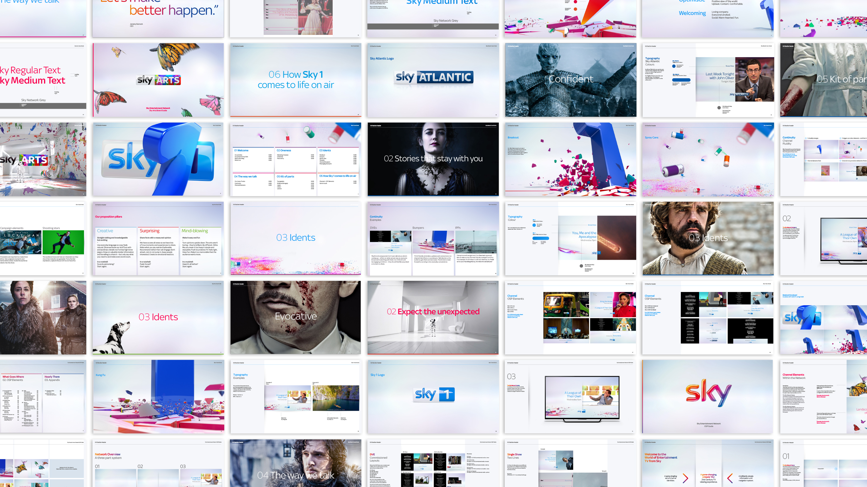
Despite dominating the UK pay-TV market for decades, Sky found themselves in the unenviable position of having incohesive communications across their multiple channels. The challenge was to create a rigorous and robust brand identity system so that when working with a vast array of disparate agencies, their teams could craft flexible, cohesive creative within a framework.
The craft
In collaboration with the group’s Executive Creative Director, the creative leads of each channel, and strategy and market teams, we set about finding what made each channel individual. The next step was finding a way to articulate a channel’s autonomy while aligning with the wider brand family.
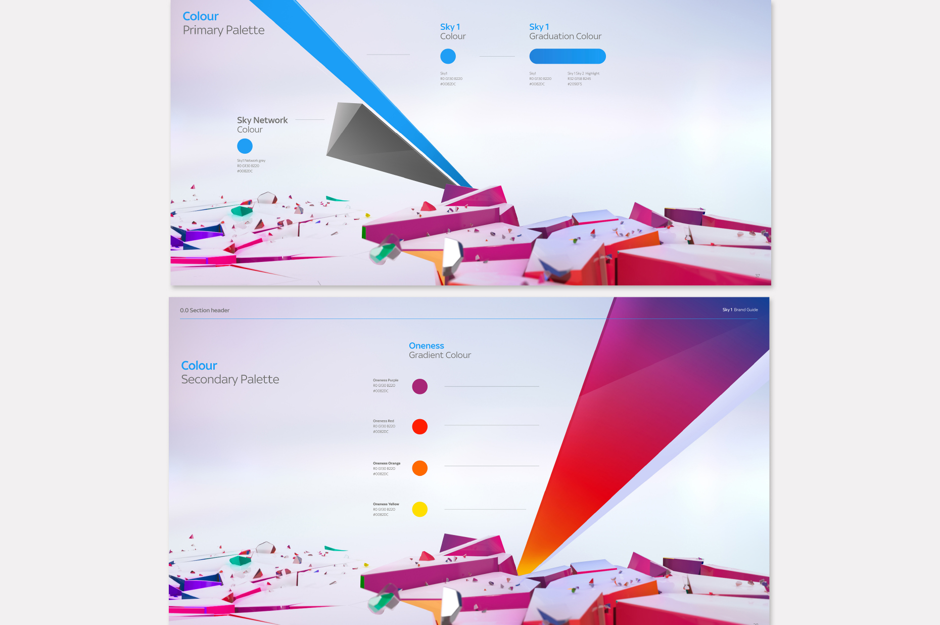
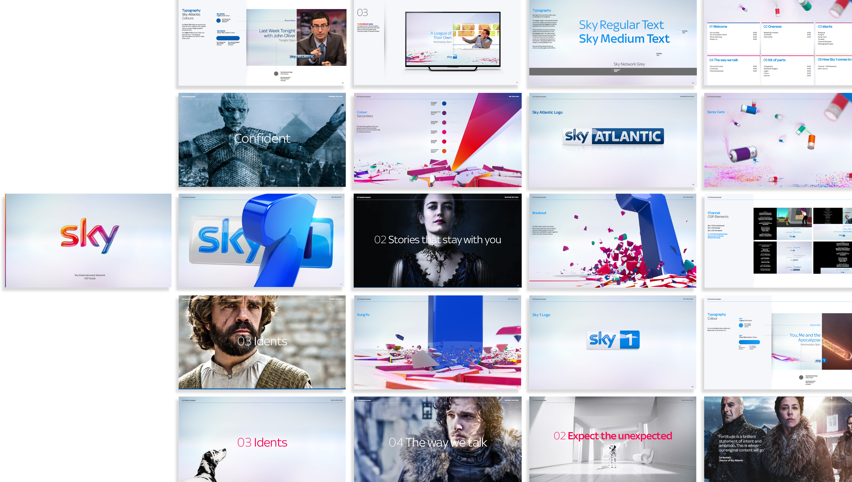
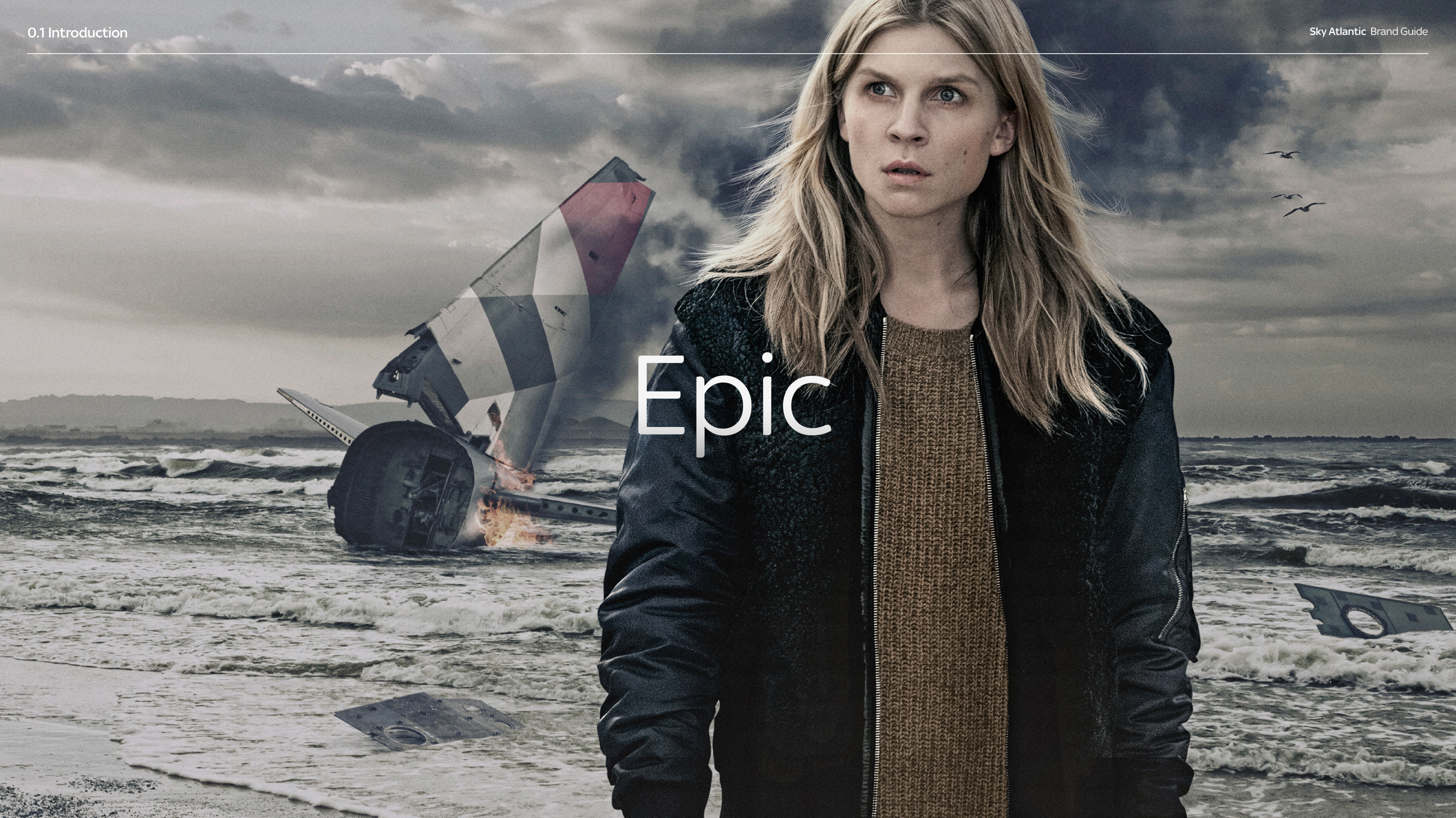
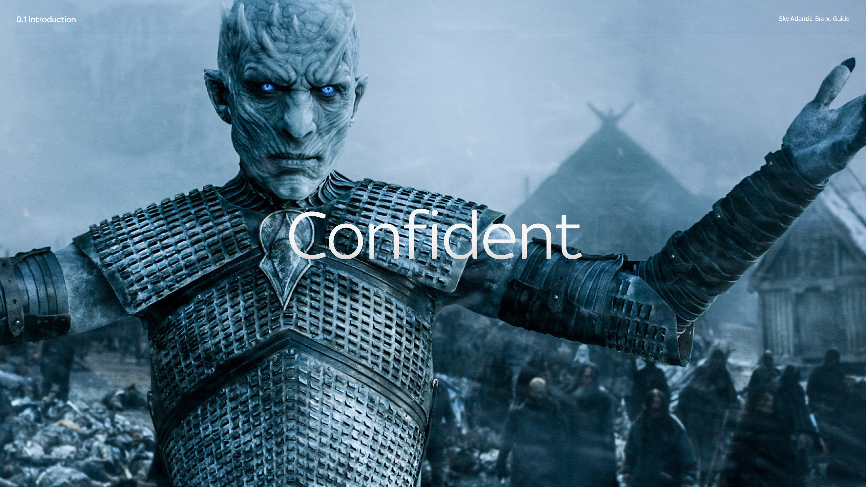
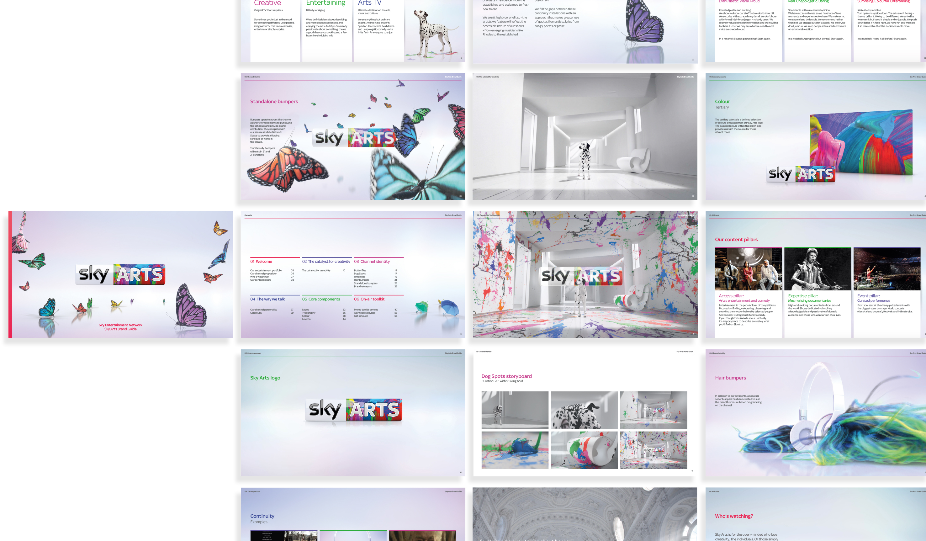
Split into four box-set style books, we used key visual moments from each of the channels to give each book a more narrative driven look. Easy to navigate and sleek in aesthetic, these books brought their previously utilitarian, technical, on-air guidelines to life and became brand bibles for the whole Sky network.
The end result
A series of beautiful and engaging books that not only brought the brand to life, but brought it together.
Despite dominating the UK pay-TV market for decades, Sky found themselves in the unenviable position of having incohesive communications across their multiple channels. The challenge was to create a rigorous and robust brand identity system so that when working with a vast array of disparate agencies, their teams could craft flexible, cohesive creative within a framework.
The craft
In collaboration with the group’s Executive Creative Director, the creative leads of each channel, and strategy and market teams, we set about finding what made each channel individual. The next step was finding a way to articulate a channel’s autonomy while aligning with the wider brand family.
Split into four box-set style books, we used key visual moments from each of the channels to give each book a more narrative driven look. Easy to navigate and sleek in aesthetic, these books brought their previously utilitarian, technical, on-air guidelines to life and became brand bibles for the whole Sky network.
The end result
A series of beautiful and engaging books that not only brought the brand to life, but brought it together.
More projects