High-fidelity visual identity.
_When the industry’s biggest music label releases the world’s most iconic albums on the highest-quality vinyl, you’re going to need a brand that changes the record.
Naming
Logomark
Visual identity
Brand messaging
Packaging
Logomark
Visual identity
Brand messaging
Packaging

Project overview
Client
Universal Music Group
Project undertaken
2022
Region
UK
Related
Sector
Music
Disciplines
Naming
Logomark
Visual identity
Brand messaging
Packaging
Logomark
Visual identity
Brand messaging
Packaging
Team
_Creative Direction
Steve Johnston
_Design
Luke Farquharson
_Client team
Millie Jones
_Writing
Paul Irwin
Millie Jones
Steve Johnston
_Design
Luke Farquharson
_Client team
Millie Jones
_Writing
Paul Irwin
Millie Jones
The context
Universal Music is home to the most iconic and influential labels and brands in music. Their latest venture was to focus exclusively on pressing limited-edition, high-quality vinyls of classic albums. More than just a visual identity, this imprint required a strategic and emotional positioning that would resonate with a very specific, discerning audience. Dedicated audiophiles and collectors of classic recordings who value not only the music but the story behind the pressing, the sleeve, the mastering, and the sonic quality.
The craft
Audiophile collectors are notoriously into the detail. They care deeply about production quality, pressing lineage, liner notes, and the cultural context of each recording. The visual identity had to match that level of intent and passion. We needed to create a brand that looked, felt, and sounded like it was made for people who listen carefully.
We immersed ourselves in the world of high-end music collecting, taking to the streets of Soho to hear what listeners were looking for when it came to high-quality vinyl releases. From audiophiles to casual collectors, we gained valuable insight into how our consumers thought, their interests, habits and what they valued the most.
We therefore knew the physical product needed to feel exclusive, premium, collectible and the narrative behind each release needed to be crafted, authentic, and storied.
But first, it needed a name. After a very long list, a long list, and finally a shortlist, Portfolio Records was the unanimous choice.
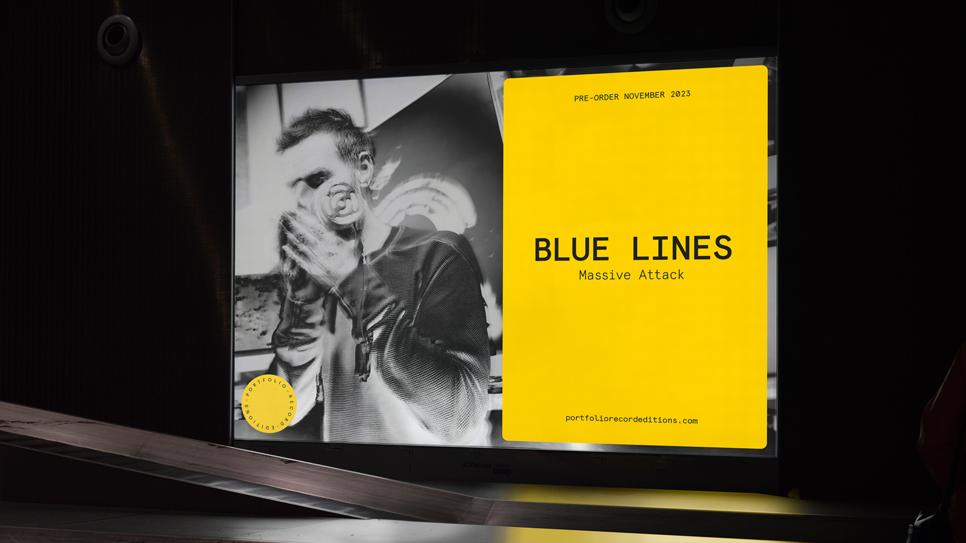
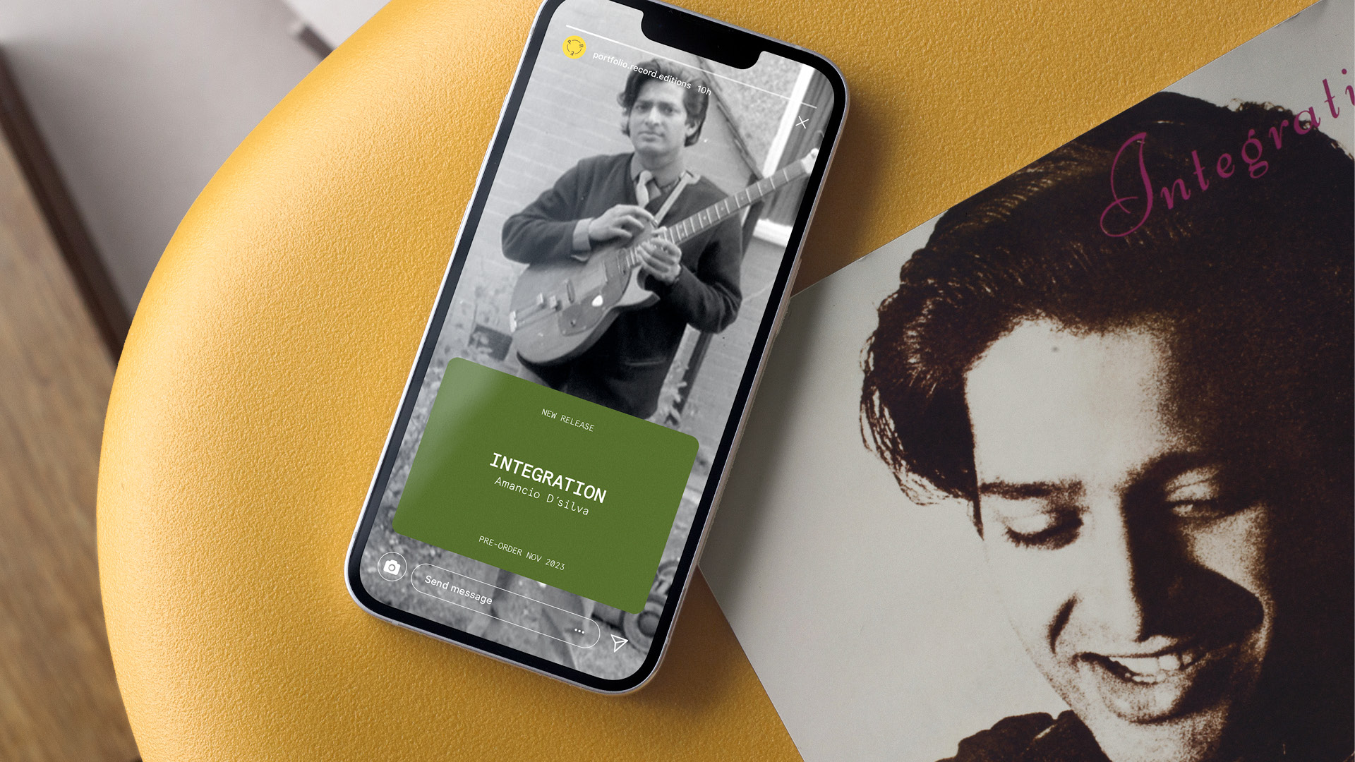
Moving onto the visual identity, we took inspiration from vinyl cataloguing and archival vernacular. This was epitomised in the primary logo, reflecting the centre sticker of records, which also doubled as a ‘seal of authenticity’ that could house the release number and production details. It was subtle, but recognisable, evoking premium exclusivity.
A mark that could live comfortably on spines, sleeves, inner labels, and promotional materials and bespoke modular packaging elements that could flex across genres and decades while retaining brand coherence. We also employed print treatments (debossing, foil, textured stocks etc) to elevate the tactile experience.
Right from the start, the brief was always about allowing each release to take centre stage and not be overrun by the Portfolio Records brand. So in terms of the wider visual world of the identity, our approach was to create a minimal design and packaging system that would elevate the original album artwork and new archival supporting material.This led us to designing bespoke liner notes and restored archival photography postcards, and developing an editorial voice that put a new spin on the well-known story of each release.
The end result
From naming the label to designing the visual language and packaging, everything was crafted to echo the clarity, depth, and timeless quality of high-fidelity vinyl. The look and feel was rooted in audiophile culture – celebrating detail, purity, and the physicality of records – while ensuring the brand resonated with both collectors and casual fans. Every element was designed to honour the artistry of the musicians while elevating the experience of the music.
Universal Music is home to the most iconic and influential labels and brands in music. Their latest venture was to focus exclusively on pressing limited-edition, high-quality vinyls of classic albums. More than just a visual identity, this imprint required a strategic and emotional positioning that would resonate with a very specific, discerning audience. Dedicated audiophiles and collectors of classic recordings who value not only the music but the story behind the pressing, the sleeve, the mastering, and the sonic quality.
The craft
Audiophile collectors are notoriously into the detail. They care deeply about production quality, pressing lineage, liner notes, and the cultural context of each recording. The visual identity had to match that level of intent and passion. We needed to create a brand that looked, felt, and sounded like it was made for people who listen carefully.
We immersed ourselves in the world of high-end music collecting, taking to the streets of Soho to hear what listeners were looking for when it came to high-quality vinyl releases. From audiophiles to casual collectors, we gained valuable insight into how our consumers thought, their interests, habits and what they valued the most.
We therefore knew the physical product needed to feel exclusive, premium, collectible and the narrative behind each release needed to be crafted, authentic, and storied.
But first, it needed a name. After a very long list, a long list, and finally a shortlist, Portfolio Records was the unanimous choice.
Moving onto the visual identity, we took inspiration from vinyl cataloguing and archival vernacular. This was epitomised in the primary logo, reflecting the centre sticker of records, which also doubled as a ‘seal of authenticity’ that could house the release number and production details. It was subtle, but recognisable, evoking premium exclusivity.
A mark that could live comfortably on spines, sleeves, inner labels, and promotional materials and bespoke modular packaging elements that could flex across genres and decades while retaining brand coherence. We also employed print treatments (debossing, foil, textured stocks etc) to elevate the tactile experience.
Right from the start, the brief was always about allowing each release to take centre stage and not be overrun by the Portfolio Records brand. So in terms of the wider visual world of the identity, our approach was to create a minimal design and packaging system that would elevate the original album artwork and new archival supporting material.This led us to designing bespoke liner notes and restored archival photography postcards, and developing an editorial voice that put a new spin on the well-known story of each release.
The end result
From naming the label to designing the visual language and packaging, everything was crafted to echo the clarity, depth, and timeless quality of high-fidelity vinyl. The look and feel was rooted in audiophile culture – celebrating detail, purity, and the physicality of records – while ensuring the brand resonated with both collectors and casual fans. Every element was designed to honour the artistry of the musicians while elevating the experience of the music.
Typefaces
Graphik
Apercu Mono
N27
Apercu Mono
N27
More projects