Thought for food.
A simple, sensory, and seasonal story.
_Micah, founder and director, came to us with a name, a place, and an ambition - for Pavilion to become a future icon of the Henley-on-Thames high street. More than just a shop, he wanted this deli, fine-food store, and cookery school to be a celebration of simple, seasonal ingredients and delicious delicacies skilfully prepared.
Visual identity
Logomark
Tone of voice
Art direction
Illustration
Motion
Packaging
Brand rollout
Logomark
Tone of voice
Art direction
Illustration
Motion
Packaging
Brand rollout

Project overview
Client
Pavilion
Project undertaken
2021
Region
UK
Related
Sector
Food & Beverage
Disciplines
Visual identity
Logomark
Tone of voice
Art direction
Illustration
Motion
Packaging
Brand rollout
Logomark
Tone of voice
Art direction
Illustration
Motion
Packaging
Brand rollout
Team
_Creative Direction
Steve Johnston
_Design
Ellen Teale
Luke Farquharson
_Client team
Alice Lyons
_Writing
Paul Irwin
Steve Johnston
_Design
Ellen Teale
Luke Farquharson
_Client team
Alice Lyons
_Writing
Paul Irwin
The context
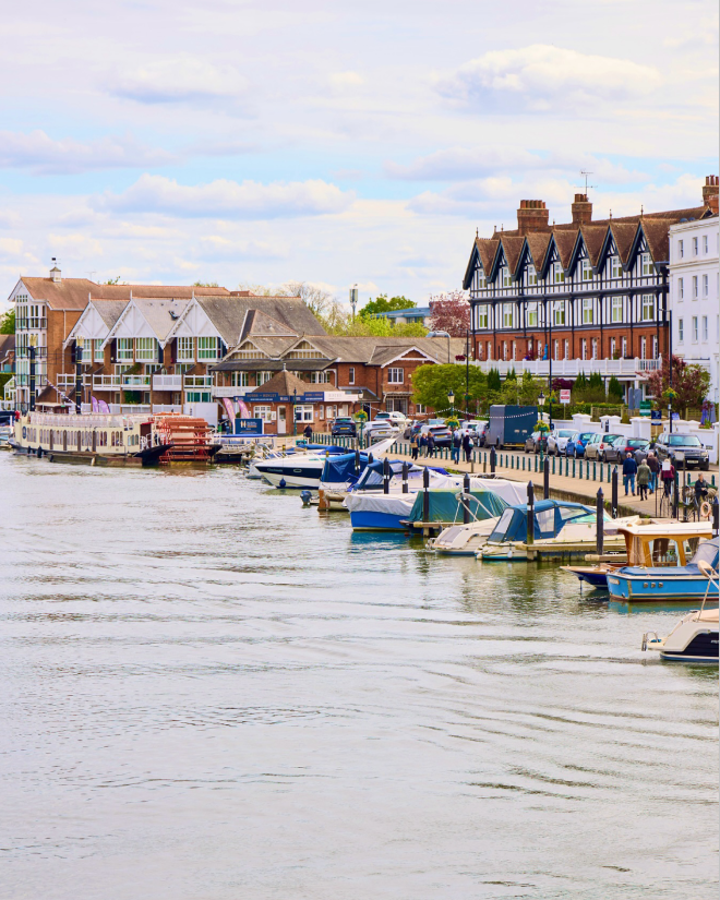
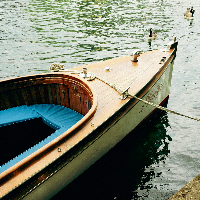
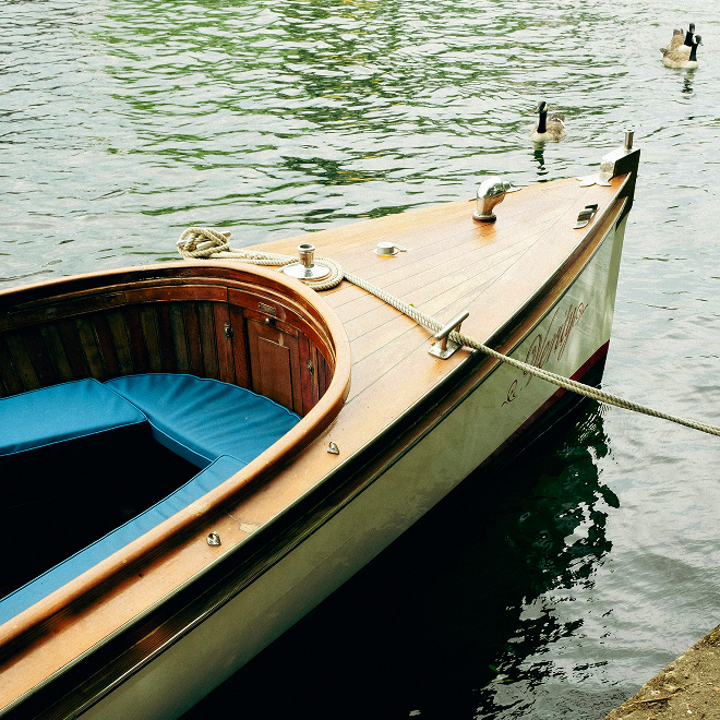
As a Le Cordon Bleu alumnus with years of experience, Micah scouted the local area and beyond to find the perfect place, produce, and people to bring the idea of Pavilion to life. This was where our collaboration began – to create a brand that would resonate on an emotional level with the Henley community, encouraging them to come back time and time again, while also being a destination deli in its own right.
The craft
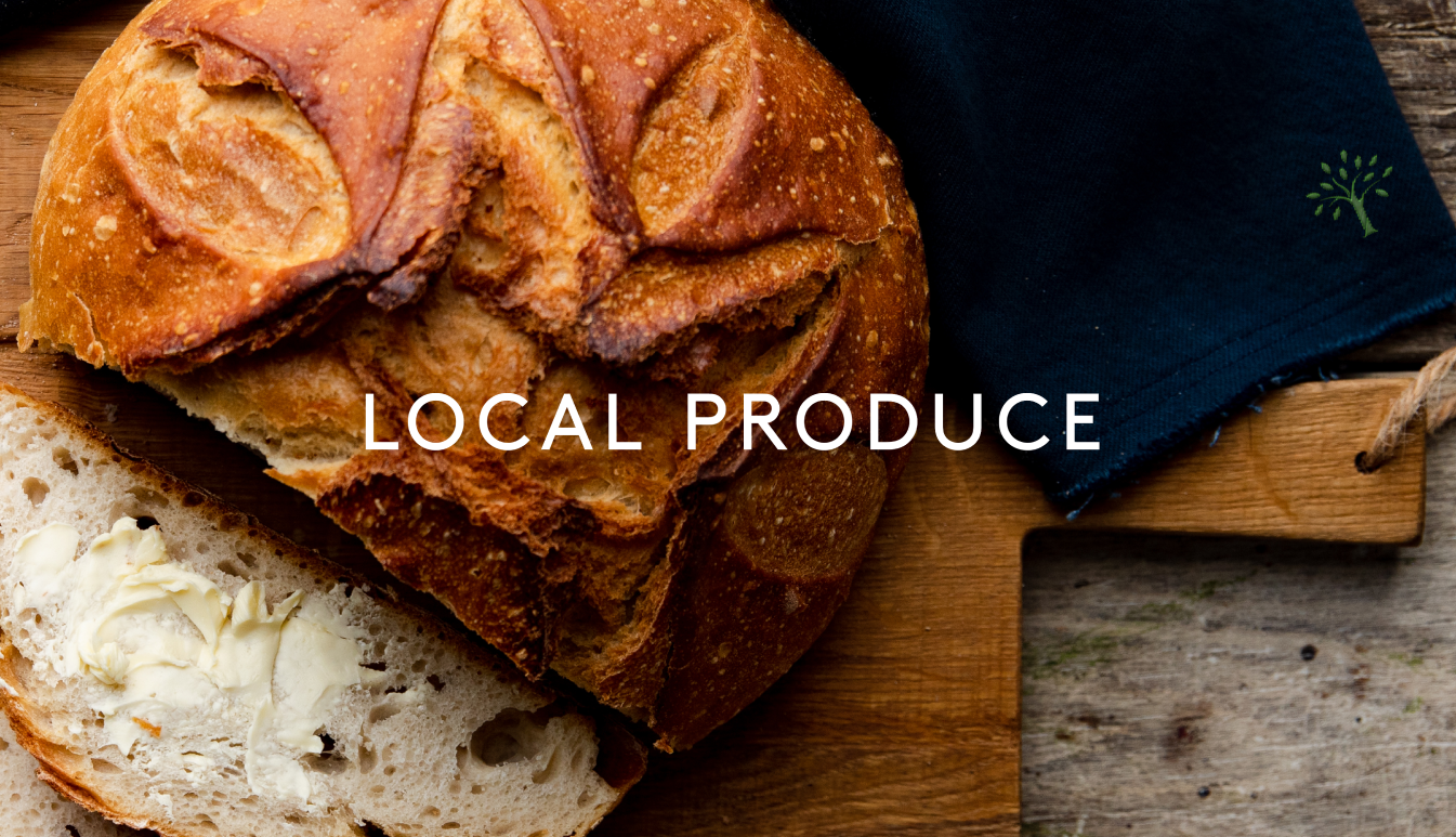
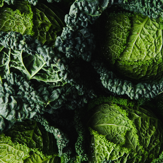
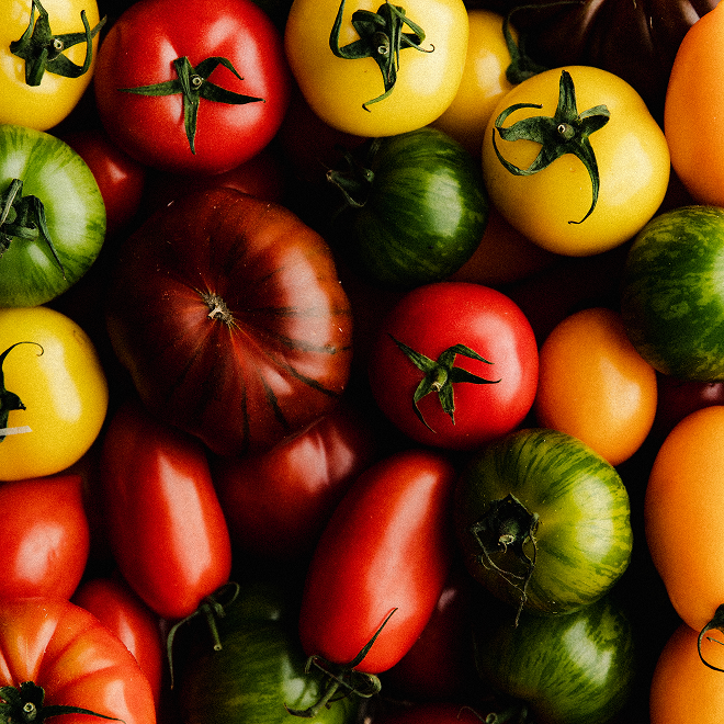
Our approach to the brand was drawn from Micah’s passion for locally-sourced produce and desire to create a space where people could come together and celebrate their love of good food.
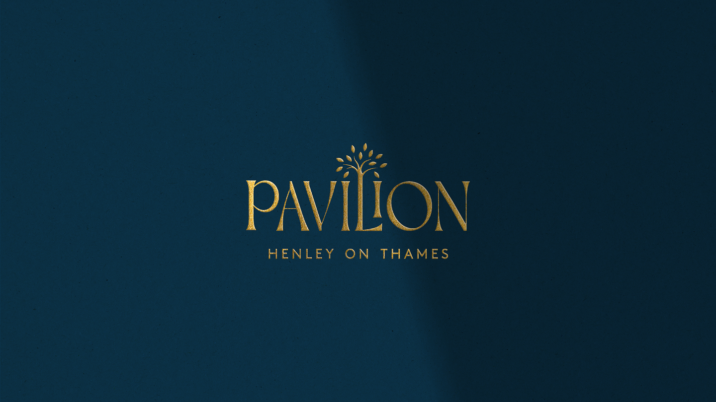
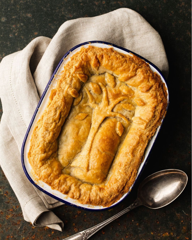
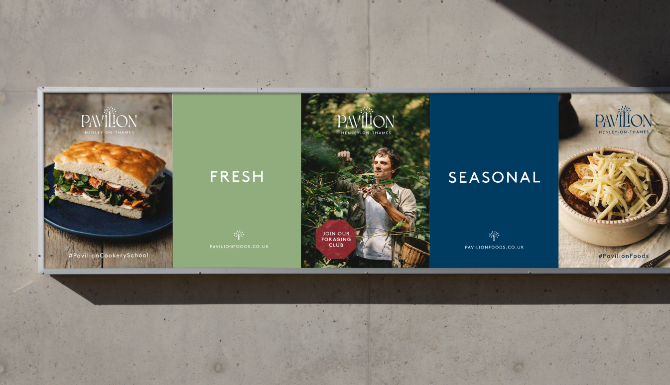
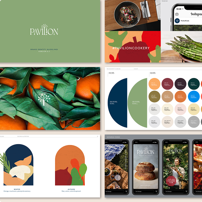
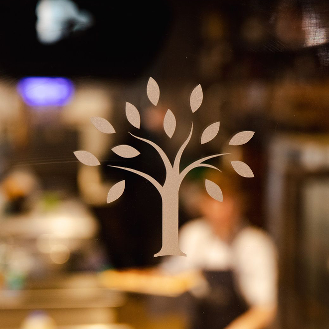
The logo we designed is fully rooted in nature and changes with each season; the illustrative tree at its centre is as seasonal as Pavilion’s produce. The typeface Dahlia, with its expressive counter forms and lilting transitions between letters, infuses the logo with a timeless elegance.
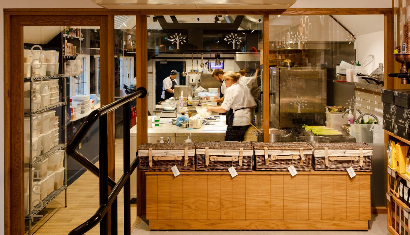
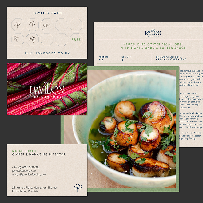
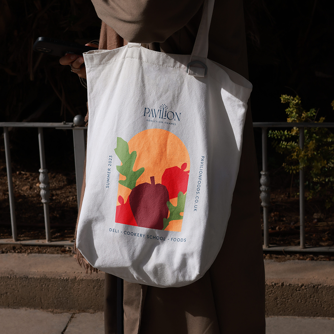
Pairing with the mutable logomark, we curated an earthy colour palette, created an authentic tone of voice, and crafted bespoke illustrations. Our approach to art direction naturally took inspiration from the kitchen pass. By understanding the conversation between flavour and feel, we created a layered and textural visual language. Adding to that, we framed and housed the visual language in shapes born from Victorian era pavilions.
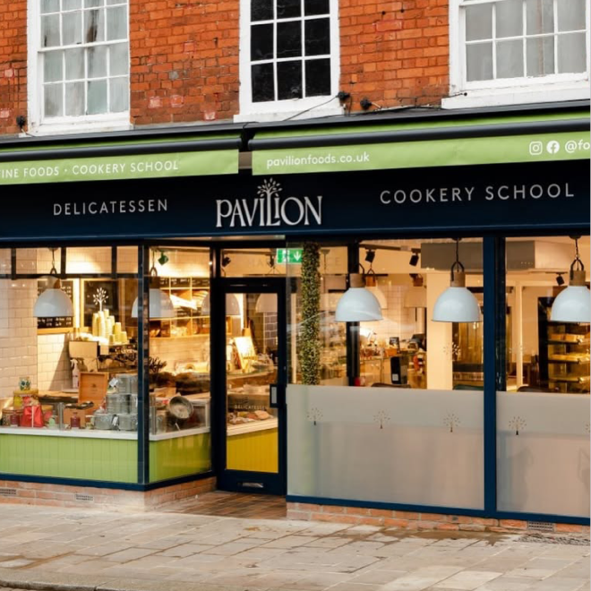
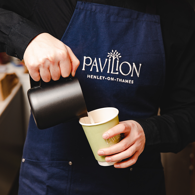
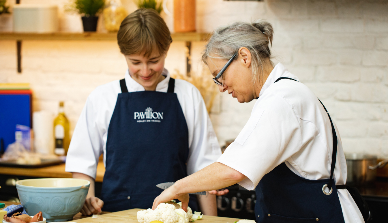
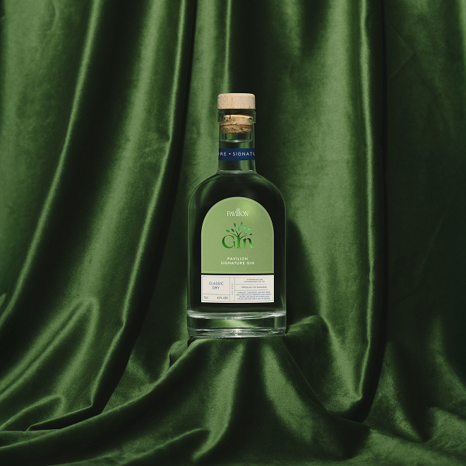
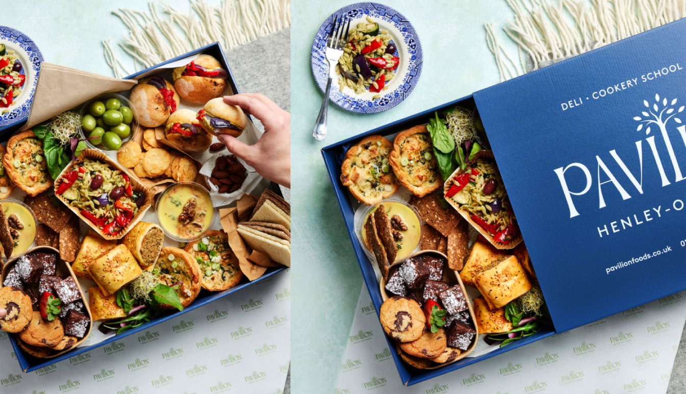
The brand was brought to life across everything - from intricately crafted labels for house conserves and chutneys to beautifully branded aprons and hampers, all the way through to fascias and thoughtfully designed window displays. The highlight was labels for their signature and award-winning gins, made in collaboration with The Henley Distillery. The labels were inspired by each individual flavour and were finished with foiling, giving them a premium but artisanal finish.
The end result
A brand rooted in community and a shared love of simple, seasonal food, Pavilion is now a cornerstone of the Henley-on-Thames food scene, offering everything from private and group cookery classes, catering and hampers to award-winning deli dishes and gins.
As a Le Cordon Bleu alumnus with years of experience, Micah scouted the local area and beyond to find the perfect place, produce, and people to bring the idea of Pavilion to life. This was where our collaboration began – to create a brand that would resonate on an emotional level with the Henley community, encouraging them to come back time and time again, while also being a destination deli in its own right.
The craft
Our approach to the brand was drawn from Micah’s passion for locally-sourced produce and desire to create a space where people could come together and celebrate their love of good food.
The logo we designed is fully rooted in nature and changes with each season; the illustrative tree at its centre is as seasonal as Pavilion’s produce. The typeface Dahlia, with its expressive counter forms and lilting transitions between letters, infuses the logo with a timeless elegance.
Pairing with the mutable logomark, we curated an earthy colour palette, created an authentic tone of voice, and crafted bespoke illustrations. Our approach to art direction naturally took inspiration from the kitchen pass. By understanding the conversation between flavour and feel, we created a layered and textural visual language. Adding to that, we framed and housed the visual language in shapes born from Victorian era pavilions.
The brand was brought to life across everything - from intricately crafted labels for house conserves and chutneys to beautifully branded aprons and hampers, all the way through to fascias and thoughtfully designed window displays. The highlight was labels for their signature and award-winning gins, made in collaboration with The Henley Distillery. The labels were inspired by each individual flavour and were finished with foiling, giving them a premium but artisanal finish.
The end result
A brand rooted in community and a shared love of simple, seasonal food, Pavilion is now a cornerstone of the Henley-on-Thames food scene, offering everything from private and group cookery classes, catering and hampers to award-winning deli dishes and gins.
Typefaces
Dahlia
Brown Pro
Brown Pro
From the outset the team at Studio Certain were able to grasp our vision, quickly turning a business plan and concept into a brand. Working in a truly collaborative manner, Studio Certain were able to create ‘more than just a logo’, but help build an identity that effectively articulates the business values in such a way that has really resonated with our customers, whether that be through digital or physical. We now have a solid foundation from which to grow the business and brand and are delighted with the result.
Micah Judah
Owner and Managing Director - Pavilion
Owner and Managing Director - Pavilion
More projects