Bold moves for a brand new product?
That's a flex.
_The road to bringing your product to market can be fraught with panic, peril and pitfalls. But with boldness, bravery, and belief in backing the business owners who are your customers, success can be sweet. We applied these traits to the Flexipay identity and campaign work to clearly and compellingly communicate that when cash flow is king, you need a card that keeps you in control.

Brand messaging
Visual identity
Logomark
Art direction
Campaign
Motion
Brand rollout
Visual identity
Logomark
Art direction
Campaign
Motion
Brand rollout


Project overview
Client
Funding Circle
Project undertaken
2025
Region
UK
Related
Sector
Financial Services
Disciplines
Brand messaging
Visual identity
Logomark
Art direction
Campaign
Motion
Brand rollout
Visual identity
Logomark
Art direction
Campaign
Motion
Brand rollout
Team
_Creative Direction
Steve Johnston
_Design
Dan Gurney
Luke Farquharson
Paul Irwin
_Client team
Alice Lyons
_Copywriting
Paul Irwin
_3D visual artist
Jack Seymour
Steve Johnston
_Design
Dan Gurney
Luke Farquharson
Paul Irwin
_Client team
Alice Lyons
_Copywriting
Paul Irwin
_3D visual artist
Jack Seymour
The context
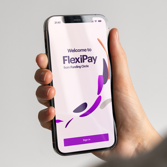
Having already delivered a six-figure rebrand for them, our next project with Funding Circle was to reimagine and relaunch the identity of their flagship product FlexiPay.
The craft
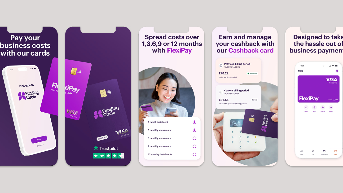
Take control of your cash flow with a flexible line of credit that gives you the freedom to decide when and how you make business payments. This one sentence descriptor was our jumping off point for our approach to the Flexipay identity.
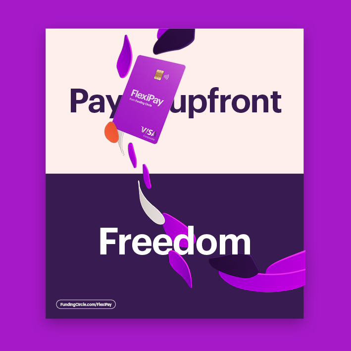
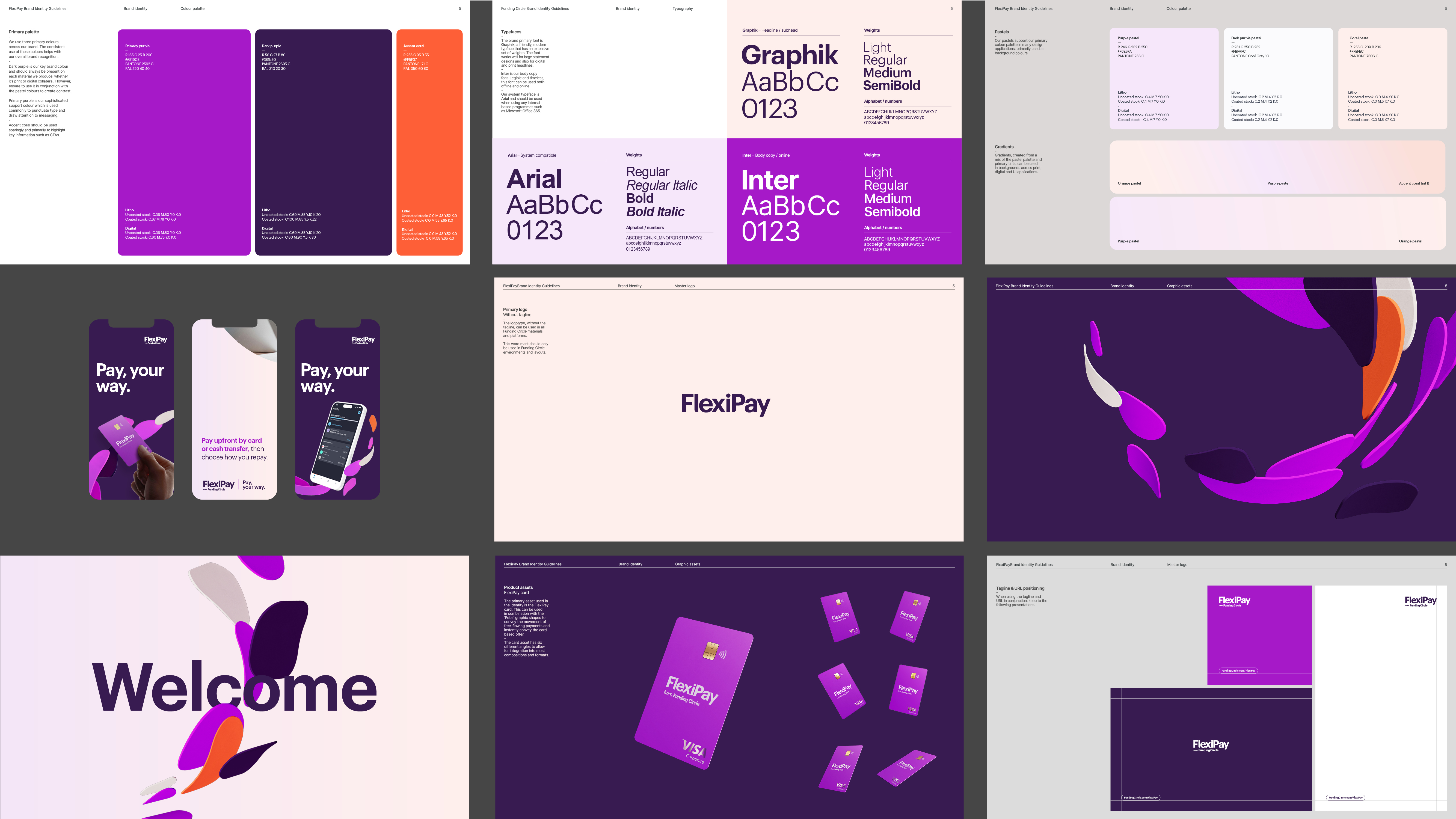
Starting with the masterbrand’s traits of Rallying and Energised, with the addition of the feeling of freedom Flexipay affords its users, we knew the visual vernacular needed to be dynamic, filled with energy, and overtly optimistic. The core of this vernacular is driven by an energetic flow of ‘Payment Petals’ represented by 3D rendered shapes. Not only do these shapes bring energy, motion, and purpose to the identity, they also guide customers through narratives, messaging, and imagery. The ‘Orbital Petals’ serve as a hero shape, playfully framing product objects or imagery. Meanwhile, the ‘Pathway Petals’ function as directional elements, leading the eye to product objects, imagery, or messages.
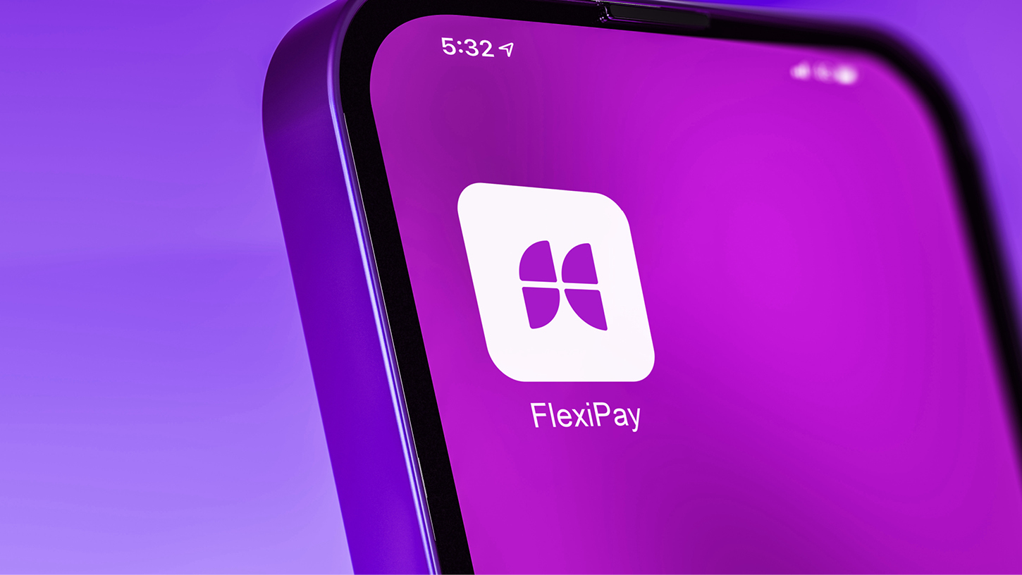
The product’s visual identity had to work at ATL level right down to in-app user journey moments of wayfinding and success. So, crafting an identity that could scale up and down without losing its spark and spirit was paramount to enabling it to survive and thrive out there in the real world.
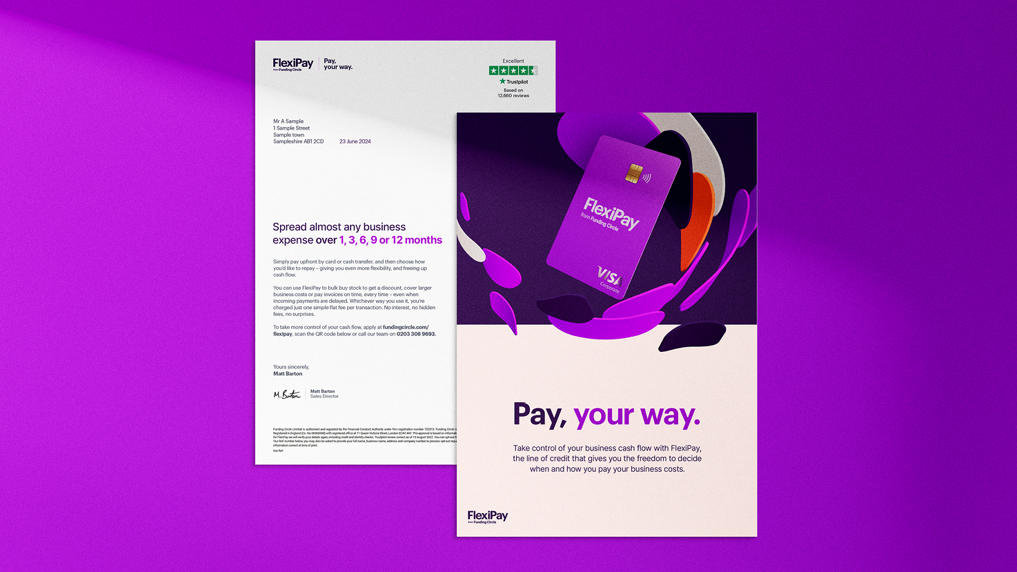
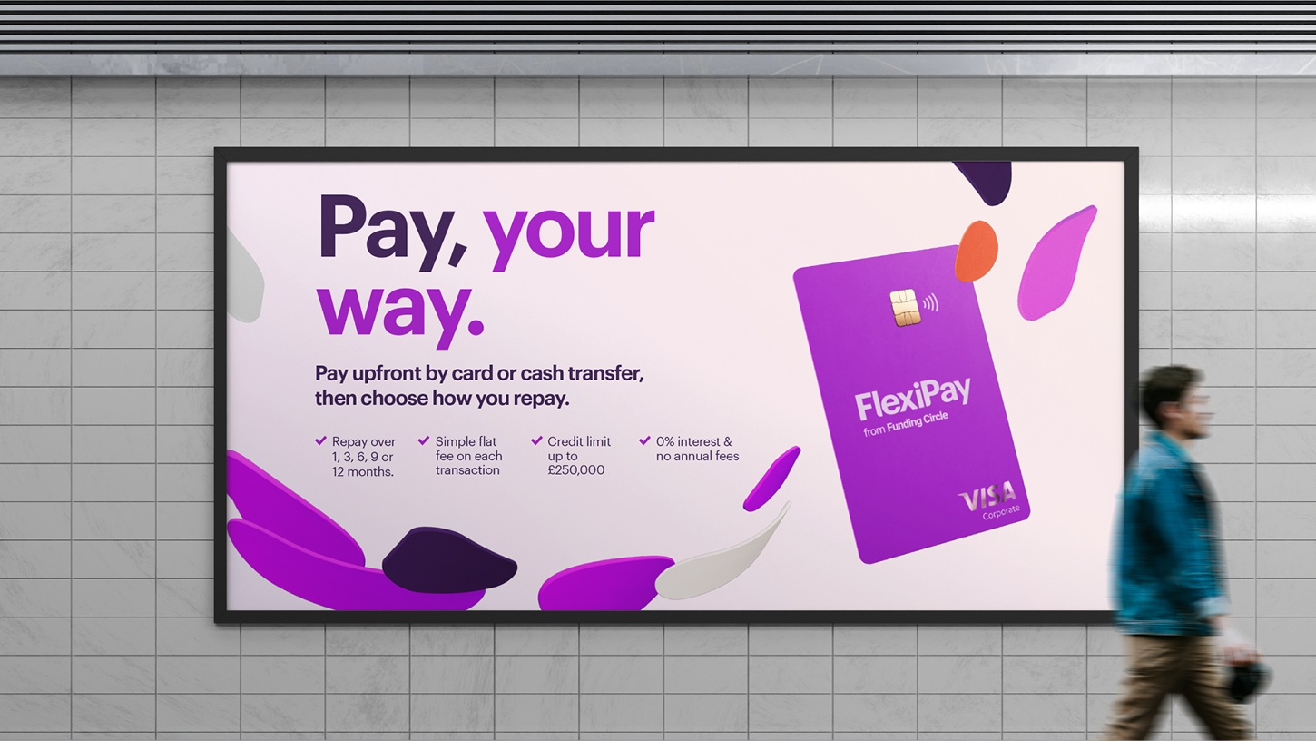
Our next challenge was to create relevant and resonant campaign creative that could both communicate and compel our prospective customers to move the needle of decision in favour of Flexipay in a very noisy business finance landscape.
The end result
From a brand new product logomark to graphic language, 6 Sheets to social ads, we created an identity and campaign with cut-through and clarity.
Having already delivered a six-figure rebrand for them, our next project with Funding Circle was to reimagine and relaunch the identity of their flagship product FlexiPay.
The craft
Take control of your cash flow with a flexible line of credit that gives you the freedom to decide when and how you make business payments. This one sentence descriptor was our jumping off point for our approach to the Flexipay identity.
Starting with the masterbrand’s traits of Rallying and Energised, with the addition of the feeling of freedom Flexipay affords its users, we knew the visual vernacular needed to be dynamic, filled with energy, and overtly optimistic. The core of this vernacular is driven by an energetic flow of ‘Payment Petals’ represented by 3D rendered shapes. Not only do these shapes bring energy, motion, and purpose to the identity, they also guide customers through narratives, messaging, and imagery. The ‘Orbital Petals’ serve as a hero shape, playfully framing product objects or imagery. Meanwhile, the ‘Pathway Petals’ function as directional elements, leading the eye to product objects, imagery, or messages.
The product’s visual identity had to work at ATL level right down to in-app user journey moments of wayfinding and success. So, crafting an identity that could scale up and down without losing its spark and spirit was paramount to enabling it to survive and thrive out there in the real world.
Our next challenge was to create relevant and resonant campaign creative that could both communicate and compel our prospective customers to move the needle of decision in favour of Flexipay in a very noisy business finance landscape.
The end result
From a brand new product logomark to graphic language, 6 Sheets to social ads, we created an identity and campaign with cut-through and clarity.
Typefaces
Graphik
Inter
Inter
I’m beyond excited to finally reveal Funding Circle UK's new brand and visual identity – the result of 1.5 years of collaborative work with some seriously talented people at Studio Certain. With a punchy new colour palette, fresh typography, and art direction that celebrates the incredible energy and drive of UK small business owners, we’re more ready than ever to take on the next chapter. Seeing my vision for the brand come to life is a career moment that’ll always be hard to beat.
Monika Chalmers
Creative Design Lead - Funding Circle
Creative Design Lead - Funding Circle
More projects